Illustrate Data-Heavy PPT Presentations with Creative Line Charts
Are you presenting a data-heavy topic? If you are presenting sales trends or product demand forecasts or manufacturing performance, you can give more impactful presentations with cohesive, creative graphs. You can avoid falling into the same old pattern of repetitiveness by using sharp, modern graphics. Elegant line charts can elevate your presentations and help your audience follow complicated presentations on difficult topics.
Ways to use line charts
Going beyond basic Excel charts will help you present and translate data through graphics. Line graphs can come in many forms. Forecast charts, product trends layouts, and comparison charts are just 3 ways line graphs can manifest.
Want to see the full set for showing data trends over time and inspire your own presentations? Check Data-driven Line Chart PPT Graphics by clicking here.
Many data visualization options exist, especially when using line and area graphs. Let’s see where and how we can use line charts.
Show actual sales and predict sales forecasts
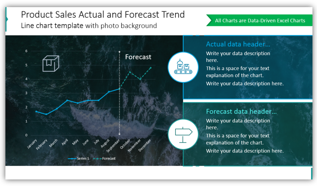
In this example, we placed the line graph over a photo background. Using an image as a background, rather than a plain, solid color makes your slides more engaging and interesting. Notice this setup permits describing both actual data and forecasted data. If you choose to present just one or the other on a given slide, you could easily customize the display.
Present comparisons and forecasted data with line charts
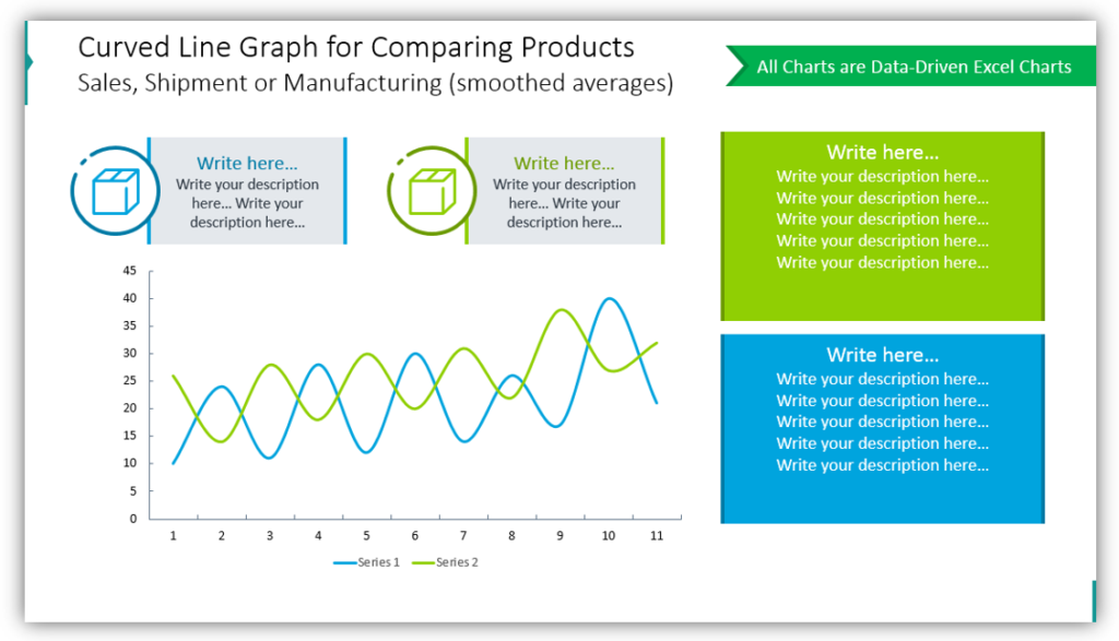
This simple comparison line plot with forecast shows both factual data and forecasted data. The white background helps keep the presentation clean and less complex. Maintaining visual simplicity is important. Especially when explaining complicated comparisons of variables. Color coding will help you build visually-appealing charts that are easy to understand. Customizing the slide further with icons to represent the variables you’re presenting will further help.
Use line charts with data labels for a product series
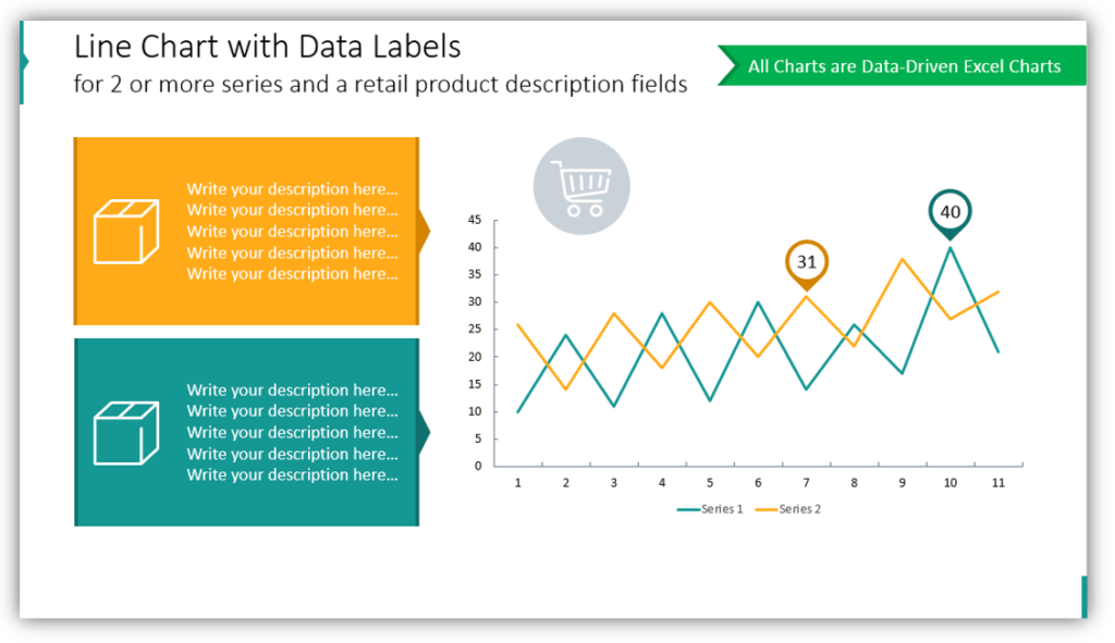
Do you need to present the performance of the two products? Use data-driven Excel charts to generate line charts. Adding descriptions of the products will offer more context. This becomes more important with each product you add to the presentation, put max up to five products or categories on one chart. Keep your charts concise and easy to understand.
Explain your sales volume or traction line
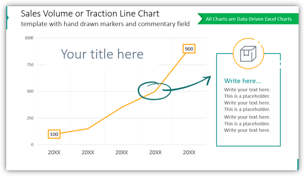
When you need to break down your sales volume or highlight a particular point, a line chart can be very beneficial. In the example, the point where sales volume changed is marked with a round hand-drawn marker with an arrow directing the audience to the description of the explanation. This user-friendly approach is simple to build with pre-made icons.
Create an Area Chart to compare 2 data series
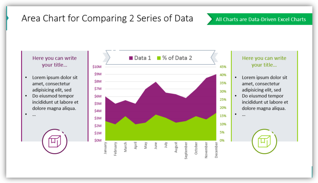
You can use the same data from line charts to create area charts, instead. Data can overlap which will help you demonstrate how different data sets differ. When you leave boxes on either side for details and descriptions. Make short notes for yourself, data highlights you’d like to make sure to mention.
Graphs and charts make a difference
Whether you’re using forecast graphs, comparison charts, or line graphs to represent product trends you can give an impactful presentation. Your audience will benefit from non-generic visuals that ‘pop.’
See our other article with data visualization examples and hints how to do chart PPT design customization.
Resource: Line Chart Data-driven Graphics
If you want to articulate Excel data in a professional way, line and area charts are a great way to accomplish that. Planning a presentation is time-consuming enough without worrying the results will not be eye-catching or helpful enough. Remove the guesswork with the pre-made graphics set:
Wish your presentations were cohesive? Use ready-made, non-default charts. You can customize them with icons from outline symbols set to ensure your slides are striking and informative.