4 Ways to Showcase Your Non-Digital Product Using One-pager Slides
Are you offering a physical product and would like to present it in a brief and eye-catching format? If you want to illustrate information on a single page, check this blog for creative visualization ideas on the product one-pager design.
What is a product one-pager and where can you use it?
A one-pager or one sheeter is the format used as marketing material to demonstrate your product information on a single page. It is a brief outline of your product, describing its features, values, and benefits in a clear, crisp, and concise way.
One-pager helps to consolidate and communicate the most relevant information regarding your product. Key information is displayed in a visual format to emphasize its importance and engage your audience.
You can download all presented graphics examples as an editable New Physical Product Presentation One Pager Layouts PPT Collection. See details by clicking slide pictures.
See how you can present the content in a professional, readable, and visually stunning manner, and ways to highlight specifications or benefits of your product.
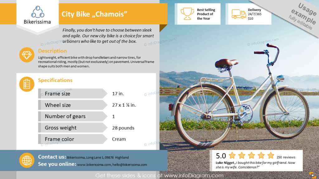
Present product overview with specification and big picture
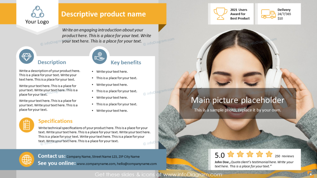
This slide includes all key facts about the product: Parameter specifications, Rating, Awards, Delivery, and a picture placeholder. Such a template can be useful when you want to give a general idea about the product.
Show multiple views on product one-pager
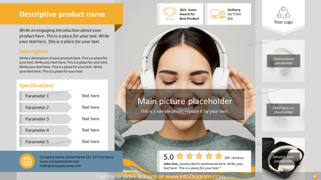
If you’d like to present your product from different sides and include more photos of it to share with your audience, have a look at the example below. There’s a place for the main picture and three smaller placeholders to include more details.
Compare few products together on one-pager
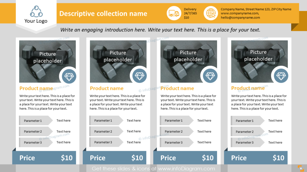
Want to include the overview of several products on a one-pager? Rather than using only their titles and bullet-points for description, you can add various design elements, such as ribbons and icons. They will make the slide more readable and professional-looking.
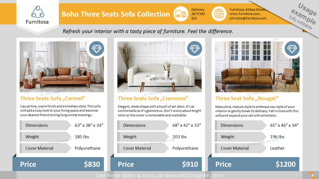
Here’s an example of showcasing three products on the slide. On our sample slide, the most essential parameters were Dimensions, Weight, and Price, so by using design elements we made them more visible:
Highlight key benefits, awards and ranking
If you want to focus more attention on product competitive values and benefits, make a room for them on the one-pager. By using icons for each section, you’ll help to create a visual association.
Guide on how to enrich product one-pager with stylish infographic
Here’s an example of redesigning a raw slide with text blocks that showcases the bike as a product and the final slide version:
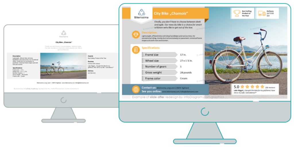
Check how simple shapes, icons, and a few tricks can help you redesign the default layout into infographics and save you time.
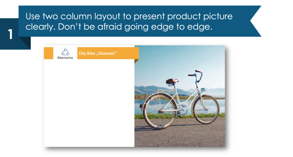
1. Use a two-column layout to present the product picture clearly.
Don’t be afraid to go edge to edge, use all the available space.
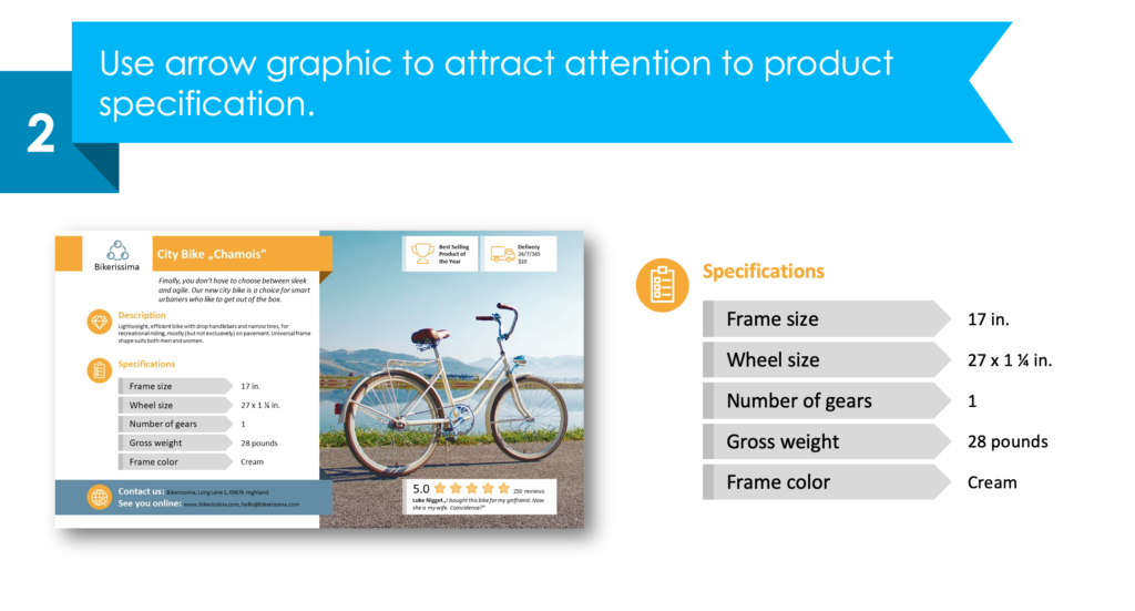
2. Use arrow graphics to attract attention to product specifications.
Instead of using bullet point text, add some simple graphical elements to show the main product information.
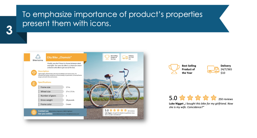
3. To emphasize the importance of the product’s properties using icons.
While choosing symbols, think about associations that come to people’s minds. For instance, we used a trophy cup for awards, a truck for delivery, and stars for reviews.
Check another example of one-pager made in PowerPoint in this article Slide redesign case: Company Snapshot One-pager Leaflet.
For more video re-design tutorials, see infoDiagram’s Creative presentation ideas YouTube channel.
Resource: New Physical Product One-Pager Presentation
The one-pager graphics in this blog are a part of our one-sheeter layouts collection. It contains slide templates for presenting single or several products on one page, in leaflet format, including content such as product picture, name, description, and more. Check the full deck here:
In case you need to extend a set of diagrams or icons, check also this universal set of elegant outline style diagrams.


