Avoid Messy Slide Look by Following Consistency Hints [PPT Design Tips]
Want to make your slides look clean and more appealing? You’ll be surprised how easy it is with the six simple tricks. This series is put together by our chief designers, and each tip will help you take your presentation from good to great 🙂
One of the common mistakes made when designing presentations is mixing incompatible styles due to incorporating graphics from various sources. The inconsistent style throughout your presentation doesn’t help its comprehension at all! Let’s see how you avoid this issue.
This article is a part of our Design Tips for Professional Presentation series, see more on our blog. You can also download the full e-book with six critical design issues and examples that will help you make an appealing presentation and impress your audience:
Inside you’ll find more actionable steps for a professional slide look, including:
- Alignment of texts, charts & tables
- Slide margins and white space – make your slide easy to read
- Natural and easy-to-follow reading flow
- How to make 1 main idea stand out
- Spellcheck for a professional reading experience
You’ll also find practical PowerPoint shortcuts that will speed up your work.
So let’s talk about consistency – one of the key principles of good design.
Consistency of colors & elements
As already mentioned, using graphics from various sources can result in a presentation with a wild mix of styles. That is not a sign of a professional approach.
Ensure all graphic elements used in your presentation have a consistent style.
Check your presentation for consistency by asking those five questions:
1. Are colors unified in the whole presentation?
We recommend using colors from the slide template palette (you can choose out of 6 color accents and their shades). If you are able to change the palette to your needs then modify it to contain your brand colors. Make sure the palette accents create a harmonic set.
2. Is the style of shapes the same?
Do shapes you have in your presentation such as arrows, rectangles, connecting lines, use the same style of shadow, outline, or rounded or sharp corners? Try to stick to one chosen style.

3. Is icon style consistent across all slides?
In case of vector icons, for instance, you can use flat, outline, or hand-drawn icons, but avoid mixing them.
4. Are illustrations of the same style?
Choose only flat and colorful illustrations. If you decide to use images in grayscale, use that style on all slides.
5. How many fonts are used?
Check if there are a maximum of 2 different fonts used in the presentation. If there are more fonts, unify them. You can replace the font in all slides at once with the PowerPoint tool Replace fonts (in the top menu Home / Replace drop-down list). Use it with care, because it updates the text fonts of all slides without confirmation (Undo still works if you want to revert the change).
Those are five areas to check at the final stage of your presentation preparation. It will take just 5 minutes and do wonders for your slides. Don’t take our word, check it next time 🙂
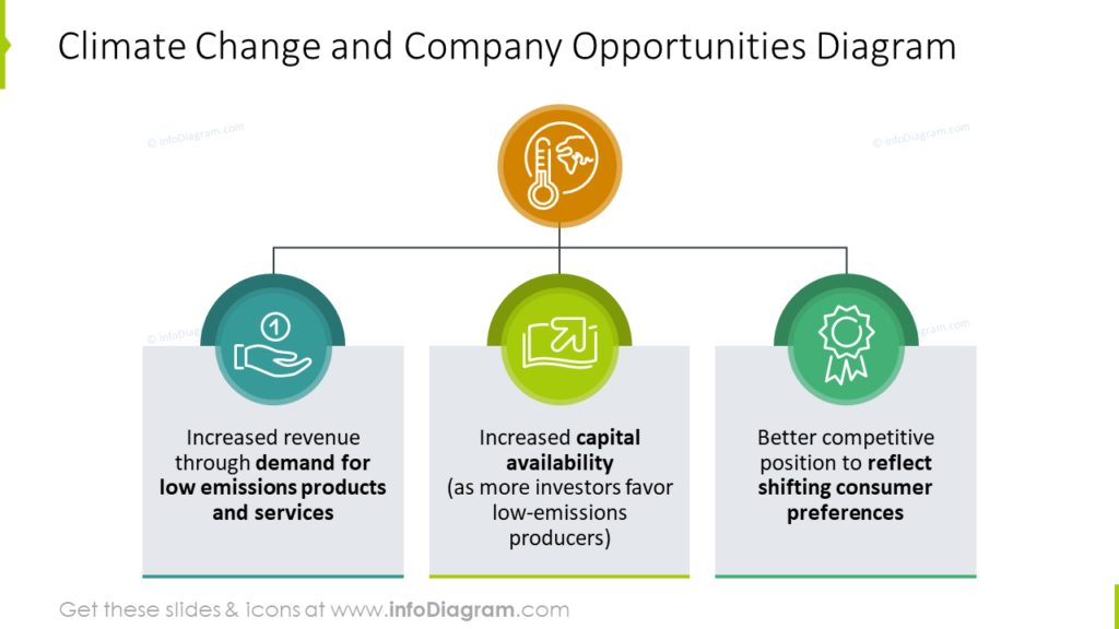
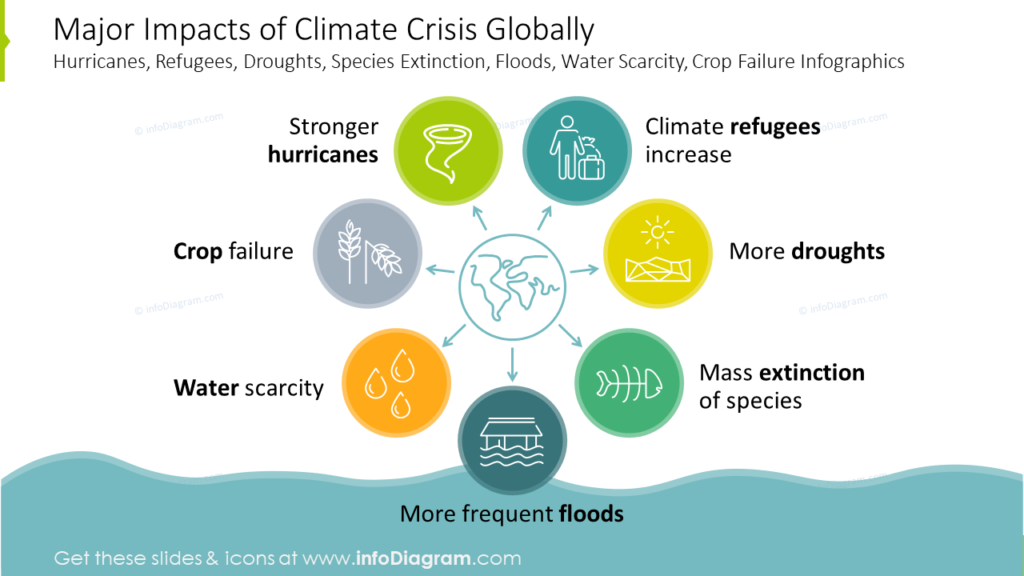
Here are a few examples of design-consistent slides for your inspiration:

Further presentation design inspiration
If you want to know how you can improve your slides further, check those resources:
- 6 design tips conveniently gathered in an ebook (including this one)
- 3 Diagram Mistakes to Avoid in Slides Design
- 5 Tips to Boost Your Presentation Slides
- Using Hand-Drawn Graphics in Presentation: Why and How
- How to Copy and Adapt Diagrams to Your Content
Get our free sample and let’s stay in touch for more tips and resources!