The Art of Crafting a Meaningful Data Chart: How to Match a Chart to Content Type
Data visualization is an essential part of data analysis, and charts are a powerful tool for presenting data in a way that is easy to understand. However, choosing the right type of data chart is crucial to ensure that your message is effectively communicated. While incorrect visualization may be misleading for your audience.
Identify the required data to be visualized
Before you start creating data chart, you will need to identify the pieces of data that are required to be shown in the visual. Consider what information is relevant and most important. Then focus on displaying it clearly so that your audience can easily comprehend the information. To effectively convey the message behind the data, try narrowing it down to essential facts rather than including too much information in one figure.
Choose appropriate chart types
Choosing the right chart type is essential in creating a meaningful data chart. Selecting the wrong type of chart can distort the intended meaning and hinder your audience from understanding the information it presents.
Line charts, bar graphs, and pie charts are some of the most typical types used. Just make sure to choose which graphic best represents your data. Also, consider how easy it will be for your viewers to read and understand it. Let’s explore the three most common data charts that we see in business PowerPoint presentations today.
#1: Line chart
If you want to display how data changes over time and identify trends, a line chart is the most suitable option. They are useful for tracking the performance of a single variable or comparing multiple variables over time. However, it is not appropriate to use a line chart when the variable on the x-axis is not continuous one.
Here are a few examples of line charts:
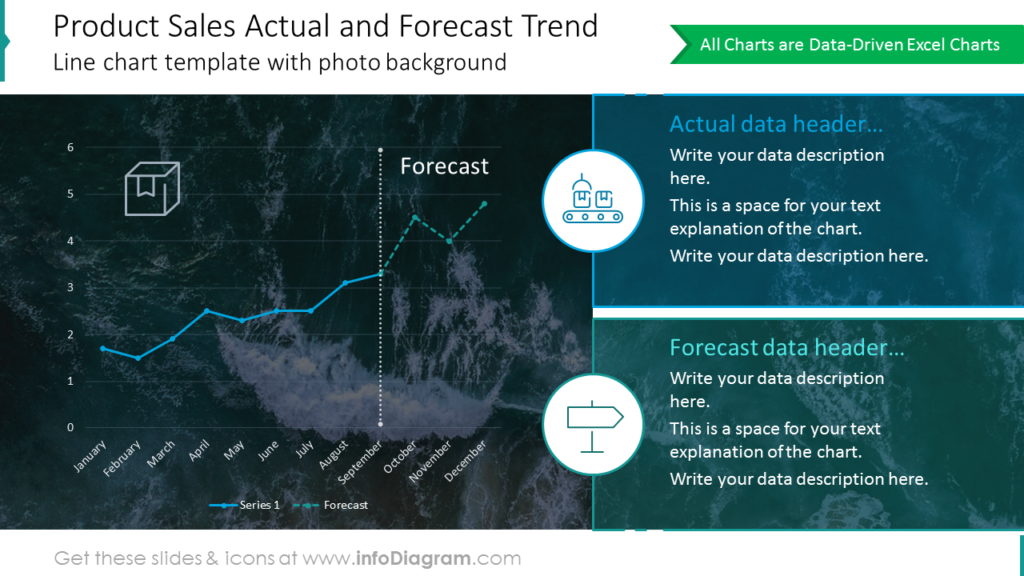
The line chart on the above slide is presented on the two-column layout. The left side, where the chart is placed, is a bit wider for a clear presentation of data. The right side of the template is dedicated to labels’ descriptions. They are visualized with category-related icons and colors corresponding with line charts on the left. Such a division makes data charts and labels easy to understand. The photo background makes the whole content visually more attractive.
We wrote another blog with examples and tricks on chart PPT redesign here.
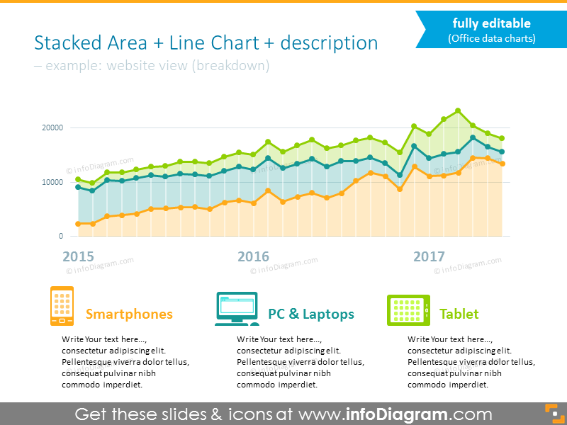
The example above presents 3 stacked areas charts joined into one. It gives a lot of data to find out, so it’s essential to make the representation of each area transparent and easy to understand. To achieve such an effect we used vivid colors for each of the charts. Also, their labels are visualized with the same colors and enriched with graphic symbols representing three devices used for website view.
When creating a line graph, it is important to choose an appropriate scale for the axes and labels. It will help to ensure the chart is clear and the audience can interpret the data accurately.
See more examples of line charts and ways to use them.
#2: Column and bar charts
When you need to display the value of a category, such as the number of sales by product, column and bar charts are the most appropriate options. These types of graphs are particularly useful when you need to make accurate comparisons between values. By visualizing the data in this way, you can easily see which categories have higher or lower values than others.
Below you can see more visual examples for your inspiration:
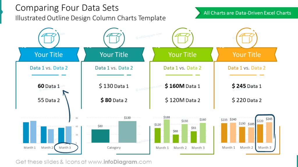
The slide above contains the comparison of four data sets. Each of the sets has the same template (icon, title, data 1 vs data 2, column charts) to make the comparison quick to scan and clear. Sets are also distinguished by colors. It’s important to keep color consistency for all data in the set, otherwise, data and the whole slide become messy and hard to understand.
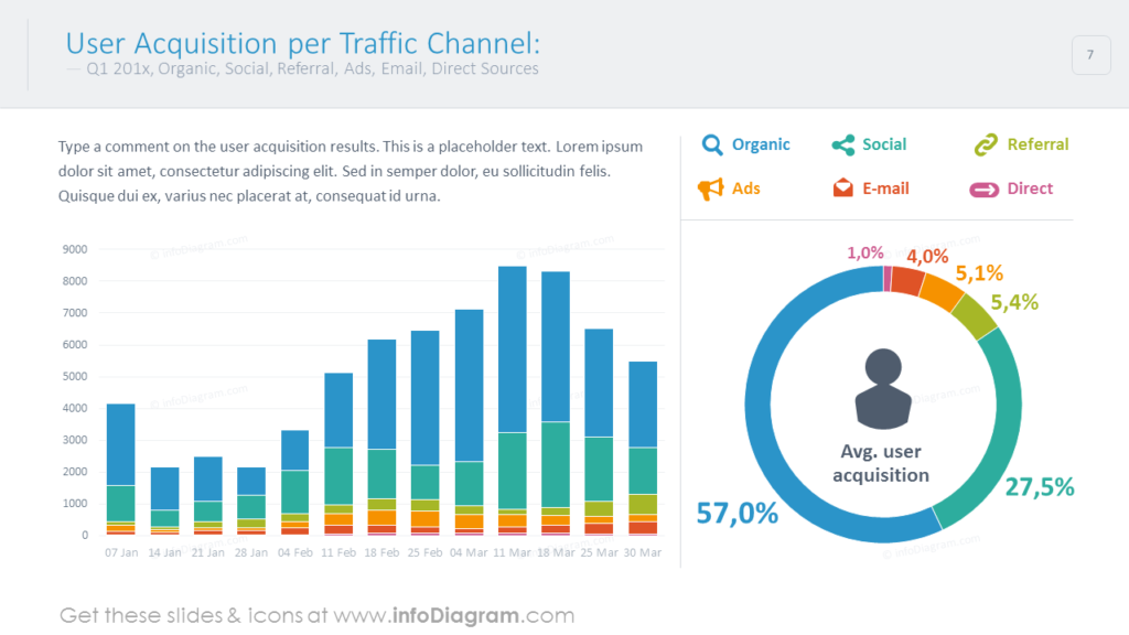
The example above presents data on two different charts, column one on the left side, and the donut chart on the right. Both of them correspond to the same data (kinds of channels), that’s why they are kept with the same colors eg. red color refers to the e-mail channel on both charts. Such a design tactic makes reading and understanding data faster.
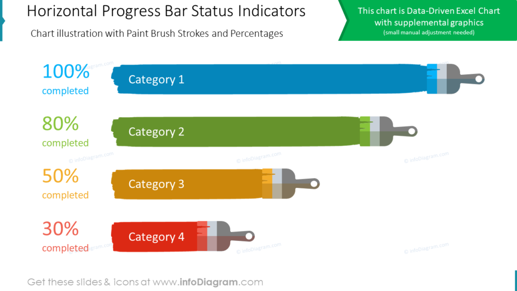
The above slide is a good example of creative data visualization. It’s not necessary to use always default rectangular charts. With such simple data as percentage indicators of the status, you can create your own graphical representation. In this case, we used the horizontal paint brash in different lengths depending on the percentage level.
Check more cases where you can use column and bar charts to lighten data-heavy presentations.
#3: Pie or doughnut chart
Pie charts are ideal for illustrating the proportionate size of individual components as part of a whole. These charts are not suitable for showing precise differences between components, and in these cases, a bar or column data chart is a better choice.
While pie and doughnut charts can be visually appealing, they can be challenging to interpret accurately. Particularly when there are many slices or the differences between the components are small.
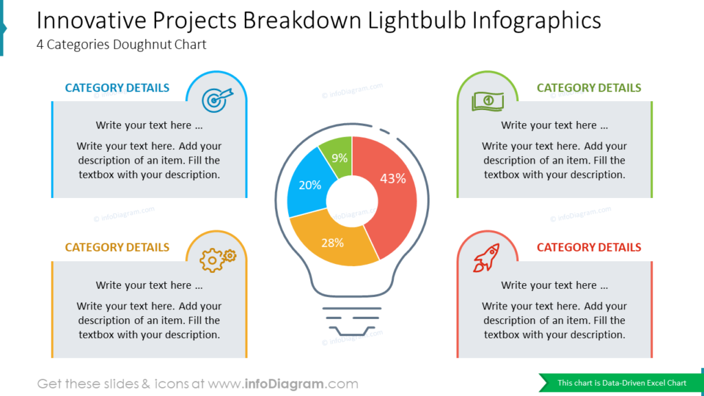
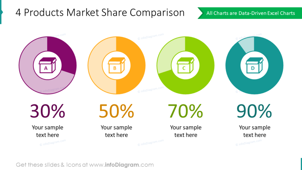
When you are making a data value comparison it’s essential to keep color consistency. One color should be assigned to one data or one label. It helps to avoid data mixing and makes charts easier to understand.
If you want to go beyond default donut charts, read on to see six unusual pie chart alternatives for any kind of presentation.
Consider using radial diagrams to present data that can be categorized, such as industry trends or survey results.
To sum up how to select a proper data chart
Choosing the right type of data chart is crucial for effectively presenting your information. In this blog, we’ve discussed the three most common types of graphs used in data visualization – line, column, and pie – and the specific scenarios in which each one is most appropriate.
By understanding the characteristics and best practices of each chart type, you can create visual representations of your data that are clear and accurate. Remember to consider the nature of your data while choosing the best chart for your needs. With these tips and guidelines, you can create informative and visually appealing charts that bring your data to life.