Add Uniqueness to Your Data Presentation with Creative PowerPoint Table Graphics
Are you tired of the same boring-looking tables in your presentations? When you’re faced with data-rich presentations or the need to convey dense information in an organized form, using the creative PowerPoint table is a good choice. Table layouts keep your content organized in rows and columns, and ensure a clean logical way of organizing information.
I know that creating a polished and readable table is quite a time-consuming process. What if there was a way to simplify this process? I am sharing here several creative PowerPoint table design examples that our designers created. Those design ideas can be adapted to other specific cases, whether it’s a comparison chart, project status update, financial report, or whatever else data you need to present in PowerPoint.
Let me show you a few slides with the custom-designed table visuals all made in PowerPoint, covering common business use cases::
- comparing the product features in a table
- presenting the yearly financial summary
- incorporating data into a dense table
- visualizing a strategic plan with a roadmap table
- adding the personal and creative touch to data with a watercolored table
Get all the graphics presented here – click on the slide pictures to see and download the source illustration. Check the full Creative Tables Graphics PPT deck.
Table with product features comparison
Visual comparison is a great option to pay attention to the presented product and helps to simplify the decision-making process. Let’s have a look at the slide below. It’s an example of a visual comparison of features for a few products.
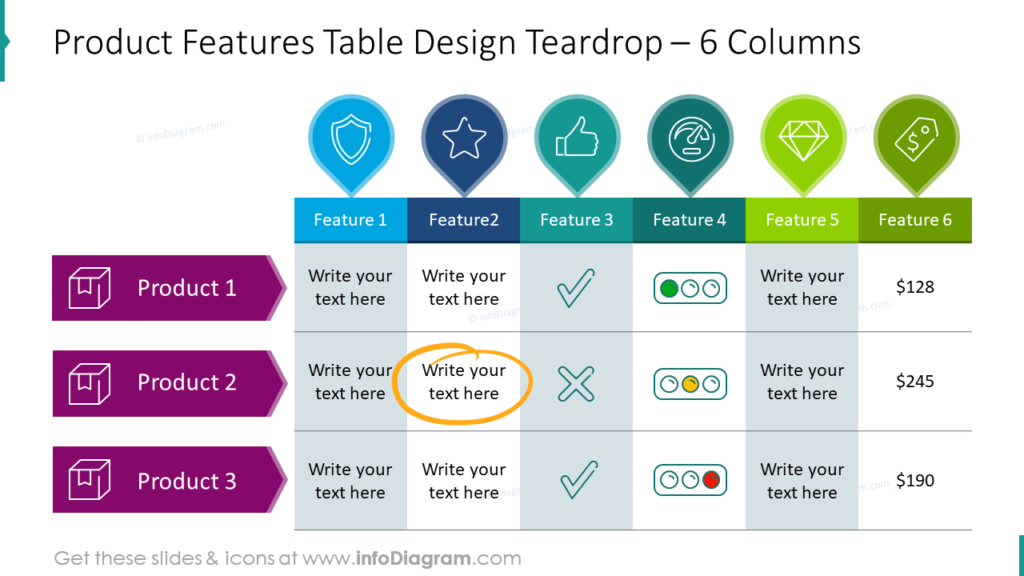
It’s a quite dense slide but not overwhelming. In this case, we’ve utilized the slide space to its maximum while maintaining safe margins (remember whitespace, which is the space without any graphical elements around).
Each of the compared features has a column in a different color (you can choose one according to your corporate guidelines) and is associated with a symbolic icon. This approach helps draw attention to the compared features and makes them easier to remember.
See how features can be presented using status icons. This allows us to quickly distinguish features such as quality, rating, price (from lowest to highest), or weight (from lightest to heaviest, for example, using a feather icon).
Explore 5 more ways to use comparison tables.
Presenting the yearly financial summary in the visual table
Tables provide a clear and concise way to organize financial data. So it’s the most natural way to arrange data from yearly financial summaries into tables. But why is it important to create an attractive and visually appealing table? The answer is simple! To not make the audience bored. What’s more, data from attractive tables are easier and faster remembered. Our slide with the yearly financial summary contains the following data:
- revenue
- cost of goods sold
- gross profit
- costs of operations
- EBITDA
- net income
The slide below presents how we arranged these data into a table.
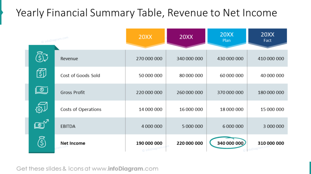
Let me share with you a clever hack that can significantly speed up the process of reading and comparing numbers within a table: align numbers to the right side of the cell. It makes clear what the number is (thousands, millions, or more).
Every significant data (in the first column) is visualized with a symbolic icon. All icons are placed on the turquoise ribbon to pay attention to this part of the table. Whereas the headers of the next columns (representing years) are distinct with chevron shapes directing to the proper column and assigned to its data.
See also how you can replace the table borders with alternating rows’ colors. In the above table, border lines are not necessary, we just decided to leave the inner borders of the columns to mark the space for numbers.
If you’re working on the annual report or company performance presentation, see how to effectively illustrate business highlights.
Incorporating data into a dense table
During my work with dense tables (such as those that have a lot of data and many rows) and slides, the most challenging is to convey information clearly and effectively. Let me show you an example of such a dense and quite universal table that can be customized to your needs.
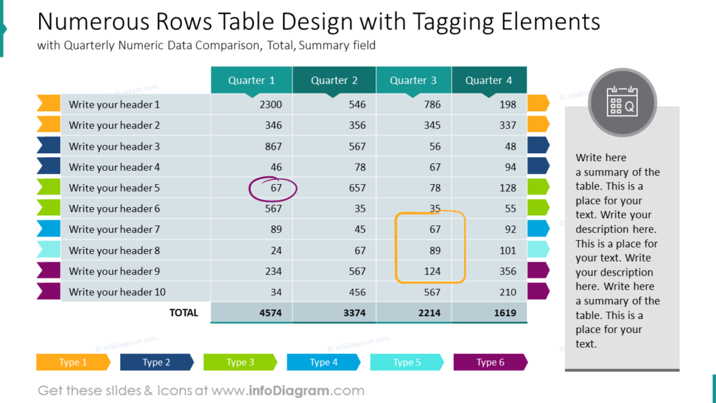
The table that we prepared has 10 rows for headers/names of data and one more extra row (marked with a darker color) for the total number of presented data. It’s also divided into 4 columns representing quarters but each quarter can be replaced with a date, year, week, project name, person name, or any other needed data.
We adjusted the borders of the table to improve clarity – they are very thin and white.
Additionally, rows are marked with colors – tags. It helps to group data by specified types. Tags can be easily edited adequately to the project or specification you work on.
Presenting such a large amount of data may require some explanation so at the left side is planned a pace for a description or summary.
Visualizing a strategic plan with a roadmap table
Did you know that visualizing a strategic plan with a roadmap table is an easy way to communicate key objectives, milestones, and timelines in a clear and organized manner?
Look at the slide below, we used a table to present the 5-year strategic plan with a roadmap table. Isn’t it looking clearly?
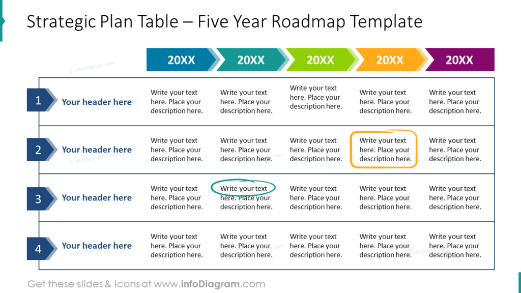
A small piece of advice: before creating the roadmap table, ensure you have a well-defined strategic plan with specific goals, objectives, and a timeline.
We incorporate the timelines into the table by labeling the first column and the first row with specific shapes like arrows and chevrons. Adding dates to the arrows at the first rows created the simple timeline and the header at the same time. By using creative highlighters we marked the milestones with a distinctive style, to make them stand out. To specify the space for each of 4 projects we decided to dismiss the inner borders of cells and keep only those surrounding the specified project.
Express your creativity with a watercolor creative PowerPoint table
Watercolors are known for their fluidity, vibrancy, and the beautiful imperfections that make each stroke unique. By infusing your tables with a touch of watercolor, you can breathe life into your data and make a lasting impression on your audience.
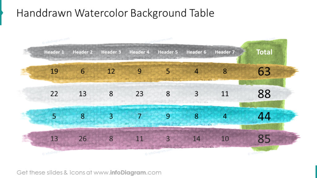
Handdrawn touch is one of the styles we like to add to our slides. The irregularities and transparency of watercolors convey a personal touch. But keep in mind that watercolors allow you to express your personality and creativity, making the presentation uniquely yours. That’s why this kind of table shouldn’t be presented at official or business meetings, it’s more accurate for private, artistic presentations or to kindergartens and schools.
How to create a watercolored pattern?
Create the table, insert a shape behind each row or column, and fill it with a watercolor texture or pattern. By the way, how to get such a pattern? You can get that watercolor graphics from us, it’s part of our slide deck mentioned below.
Creating the data tables in PowerPoint – Good Design Practices
The main goal when creating a table in PowerPoint is to convey information clearly and effectively. Well…it sounds so easy, isn’t it? But how to achieve it in practice? I grasped and summarized below the most important good practices:
- Align numbers to the right side of the cell, to make data quickly recognizable (hundreds, thousands, millions, etc.)
- Use color coding for rows, columns, or specific cells. This can help viewers quickly identify key themes or areas of focus.
- Clearly label the columns and rows of your table with descriptive headers. Headers should be concise and informative, helping the audience understand the content of each column or row
- Don’t overcrowd your table with too much data. If the table becomes too dense, consider breaking it into smaller, more focused tables or using other visual aids like charts or graphs.
I’m sure that with these basic design rules, you can design stunning table slides and make a lasting impression 🙂 Explore more ways to improve your tables’ look.
Resource: Creative PowerPoint Table Graphics
The examples above used the graphics from a PowerPoint template with creative table graphics:
If you are looking for more pre-designed table templates in PowerPoint, try our slides from the Business Table Graphics & KPI List collection.