How to Beautify a Table in PowerPoint
Tables can help you present your information or data effectively. If you want to make them look more professional and appealing, then here are a few examples of outline tables for your inspiration.
Why use outline table KPI diagrams?
Tables are one of the most popular tools for presenting and comparing data. Upgrade your regular tables and enhance them with graphics for showing yearly marketing activities, project status & features, pricing comparisons, and more. The outline infographic style is subtle and will complement your message without overshadowing it.
You can get a source of graphics presented in this blog by simply clicking on the slide picture, or checking the complete PowerPoint collection right here.
Where can you use outline tables?
Here are several examples where you can apply these tables:
- Plan & present yearly marketing activities such as advertising campaigns.
- Show project costs with a description.
- Highlight values on budget tables.
- Create a comparison of budget & expenses for an annual summary.
- Compare the status and features of products or projects.
- List services with additional descriptions.
Let’s discuss some of the PPT table designs in detail.
Design of Dense Table with Icons and Marker
Let’s take a dense table case. If you have a situation where you need to show lots of information, with tens of rows, then you need to simplify the table design as much as possible. The example below shows the various aspects of different products, which you can present in an eye-catching manner.
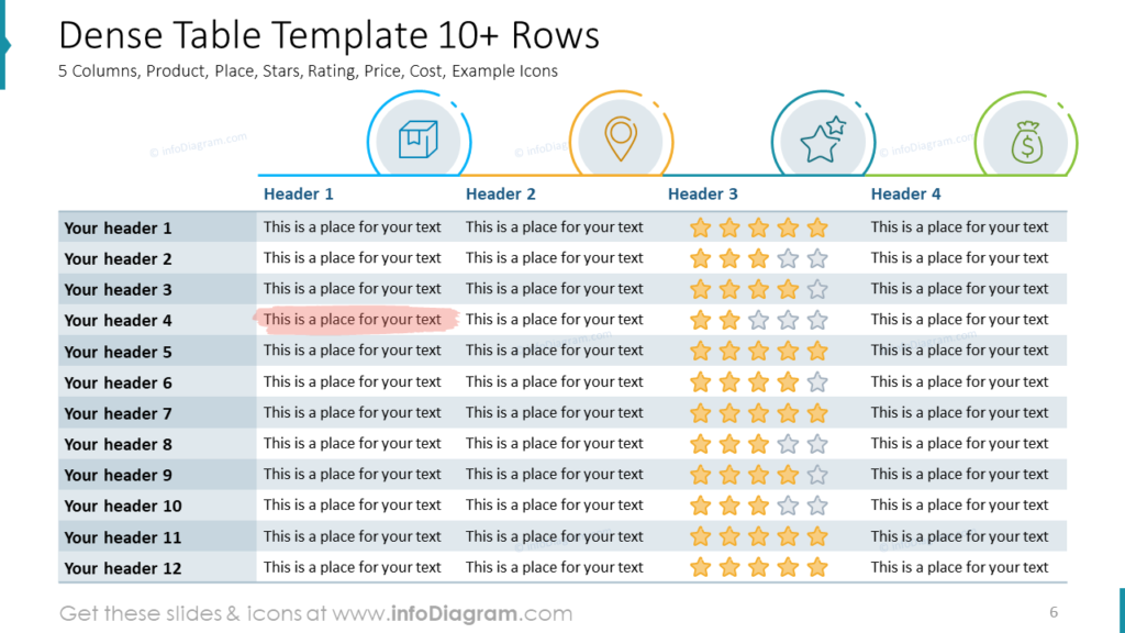
You can still present such dense data in an elegant manner like in the above table. The key is to keep it clean, don’t use the heavy grid, better use various colors of row background. You can display the specific column category such as product, place, rating, and cost with help of icons if you have some space above the header row. Avoid heavy graphics, consider using light outline icons instead.
Notice the use of a handwritten mark to highlight the crucial points in the table.
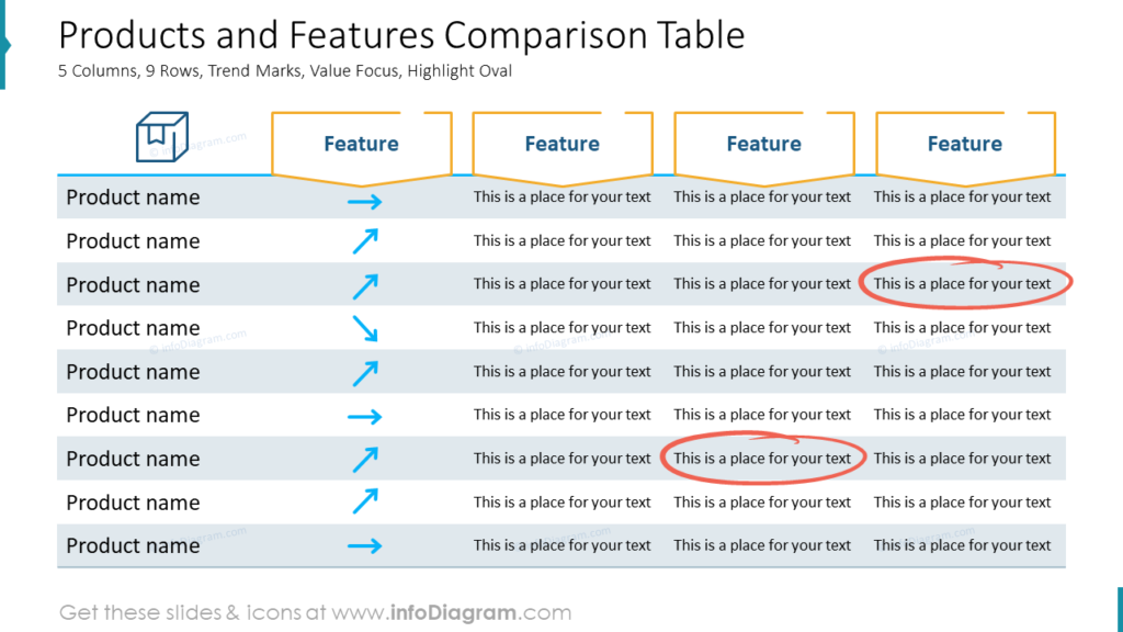
Example of Comparison Table
Tables are an exceptional structure to present a comparison of multiple features. You can replace some categorical information with an informative symbol to make the table more readable. See how we used the icon of an arrow to show if the value is increasing, decreasing, or not changing.
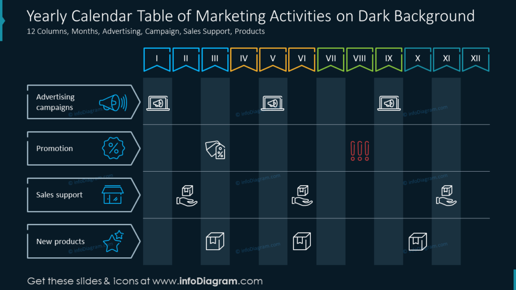
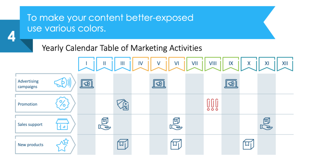
Presenting Yearly Calendar of Marketing Activities using Outline Tables
Here is another example showing the usage of colors and icons to make the table look more appealing. The table has a dark theme, and you can also see how the icons help indicate the row categories and timeline deadlines over months.
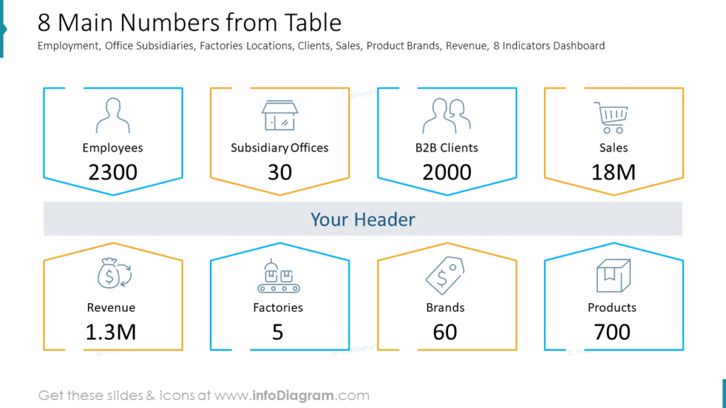
How to Present Key Values or the Essence
While the tables are pretty effective, they are not the best way to present information in some cases. Usually, the essence lies in a few extracted values from the table. Therefore, you should only display the imperative data on the layout.
You can go for the layout that presents the KPI number as seen above. Notice how each data is illustrated by a distinctive icon for a better visual appearance.
Case Study of Redesigning a Calendar Table
Let us show you how you can redesign a table with a calendar in just four steps.
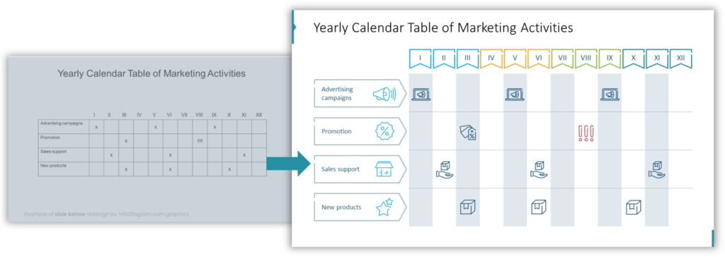
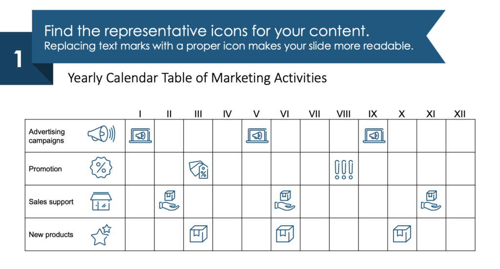
1. Use icons instead of text marks in the table
You can identify representative icons for your content. Simple text marks might not leave a lasting impression. Therefore, you can replace them with a proper icon.
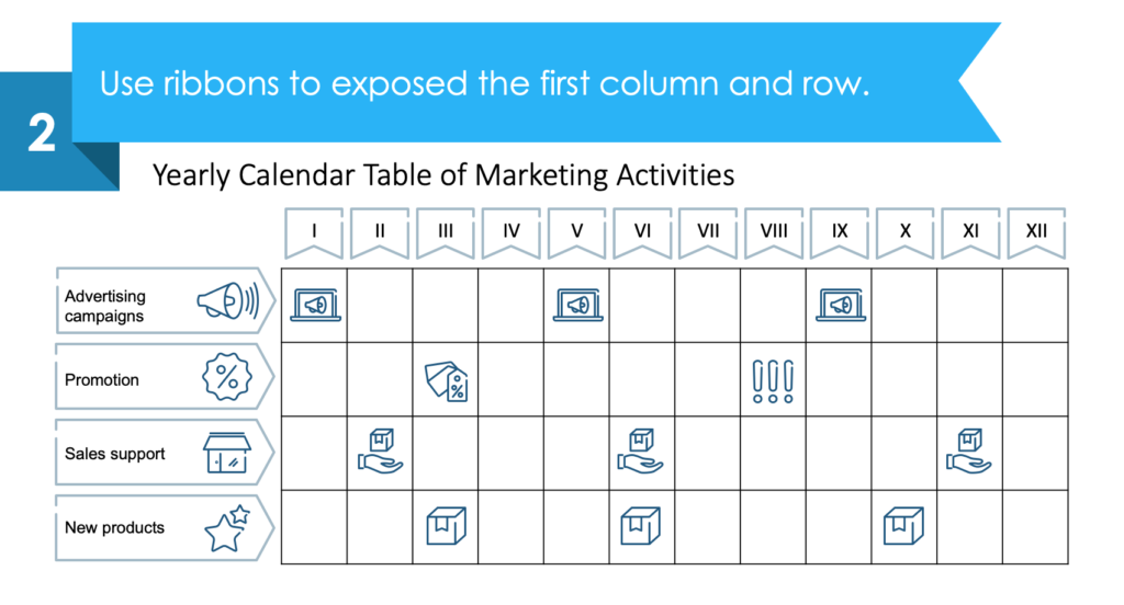
2. Redesign a table header and 1st column
You can utilize the ribbon shapes to distinguish the first column and header.
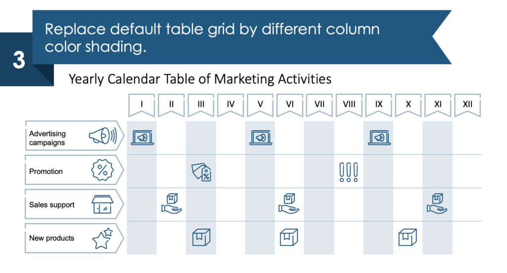
3. Get rid of the standard table grid
Instead of the standard default grid, you can add various column color shading.
4. Apply colors to make a calendar outline table look great
You can expose your content in a better way by using color variations. It will help you get a clear idea about each quarter of the year.
Summarizing the Creative PowerPoint Tables Design
Eye-catching table designs can enable you to enhance your presentation by presenting the fundamental data and information in a visually appealing manner. It helps you express the essence of the tables, improving their appearance in PowerPoint.
Resource: Outline Presentation Tables and KPI Design
The tables and KPI designs are available in our infoDiagram collection. You can get plenty of slides and templates to present your tables in a visually appealing manner. Check out the link below:
If you prefer hand-drawn scribble style more, check design ideas on how to make a presentation table more eye-catchy and creative.
Moreover, you can extend the deck with a set of elegant outline style diagrams with different graphics, styles, and a lot more.


