Tricks to Getting Creative With Presentations Preparation
Sometimes the issue isn’t with making sure your audience stays engaged, it’s keeping yourself interested, too! It’s time to get creative with presentations! If you are not excited about the material, there’s a high probability that your audience won’t be, either.
One way to rejuvenate your excitement and look at your content from another perspective is to get creative with presentations! Sounds simple, but is it? When audiences see an approach that is unique or unfamiliar to them, they are more apt to appreciate the content because they see it differently, themselves.
Creativity and Computer Work
I’m sure you know it’s a good idea to think outside the box. Have you been staring at the blank computer screen looking for a way to get creative?

Stop! Give yourself an extra 15-30 minutes of planning time, and shut off that screen. Computer work kills creativity. There is nothing more intimidating than a blank screen, and if you’re like most of us you could probably stand to spend some extra time away from the computer, anyway.
Now, contrary to what might feel normal when planning a presentation, pull out some paper. Remember, we want to be creative! Part of that is doing something different. Doing something unique has a better chance of yielding different, and dare we say it, creative results.
The Fun Parts – Writing down the essence
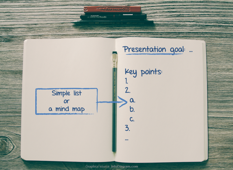
Presentation Goal
Jot down your goal on a real paper. What do you want to achieve with this presentation?

Here are a few examples of presentation goals:
- Teach new technique to trainees
- Share work from home opportunities with stay-at-home moms
- Promote good email etiquette in front office staff
Notice that good goals feature a subject, the outcome, and the audience. This helps you capture the full essence of your presentation.
Key points
Now write out your key points. When you’re putting these down, you don’t need to go in any particular order. You’re just brainstorming at this stage. Once you have fleshed out everything you want to say, sort through your points and put them in order.

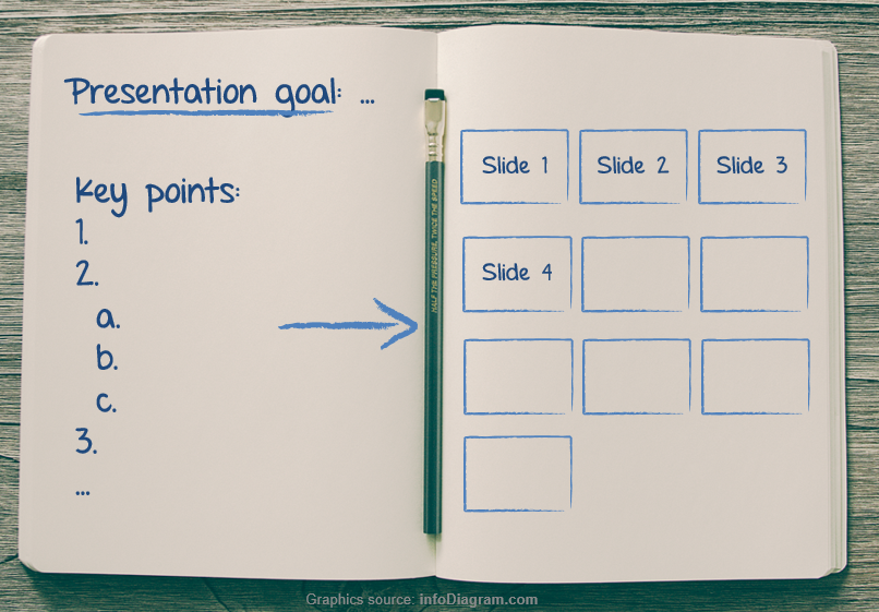
Slides structure
Once the “key points” stage is completed, go a step further. Sketch out how you’ll put the info into slides. If you aren’t very artistic, that’s okay. Draw boxes or fold your paper into squares and just write what you’d like to use in the slide boxes. (Sure, writing down “stock photo of a sad dog” might not be very glamorous, but if it helps you to give a better presentation, we’re all for it.)

Once you’ve got your plan onto paper, your creative muscle is fully activated. Now all you have to do is pop back onto the computer and make it happen.
Now What? Filling the content
Since all your planning is done, the actual presentation creation steps should take half the time it usually does, or less! Use that free time to enjoy how much more interesting your presentation is, now that you’ve put extra time into crafting the design and purpose.
For ideas on designing a specific slide’s content, check the articles below:
Need other presentation boosting tips? Check out these posts:
- How to choose a proper diagram to visualize slide message
- Build an Engaging Presentation using Structure Slides
- Evaluate Your Presentation Engagement with 4MAT model
Remember
- Artistic and creative aren’t synonymous. If you can’t draw, don’t panic. As long as you know what the sketches mean, that’s all that matters.
- Taking time to plan can save you a lot of time in the long run. Doing something different or stepping away from the computer can be enough to get the creative juices flowing.
- If you can draw a box or fold a sheet of paper, you can sketch out a great presentation.
What are your favorite ways to get creative? Have you resorted to the paper & pencil methods before? We’d love to know what tips you recommend so we can pass them along to other readers. Let us know in the comments or by reaching out via the contact form. We’d also love to help if you need assistance getting your presentations to pop!
Do you like graphics of sketched slides or goal post-it card icon from this post? Make it on your own. Check graphics resources used in the examples above:


