How to create infographics in PowerPoint – part II
This is a continuation of part I. In the previous post I have described how to find data and prepare slide format. Also how to setup background for your infographics.
How to create a header
Infographics should have a distinct header. Text on a flat banner will make a nice one. I used a banner from banners for infographics for PowerPoint package.
 |
| Banners for infographics – PowerPoint format |
How to create a bar chart manually
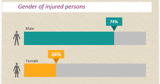 |
| The simple and clean bar chart in PowerPoint for infographics |
It may be surprising, but sometimes it is better to create a bar chart from scratch. I do it when I want to have a simple, clean and minimalistic chart. It is faster to create one by yourself than trying to format a PowerPoint chart. Here is step by step instruction:
-
- Create a rectangle which will correspond to a 100% length.
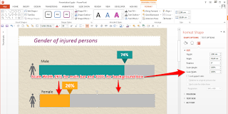 |
| How to scale boxes to make a custom bar in PowerPoint |
- Duplicate rectangle (Ctrl-D).
- Change color.
- Change size in “Format Shape” -> “Dimensions” -> “Scale Width”. Set actual value of the stat you want to display, e.g. 26%.
- Nice extra touch to the bar chart is the indicator like this one. It is made with one rectangle and triangle.
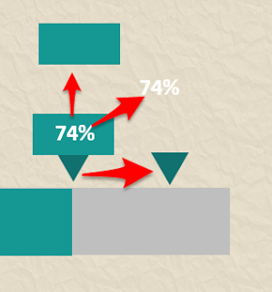 |
| How to create a bar chart indicator |
Custom callouts for data
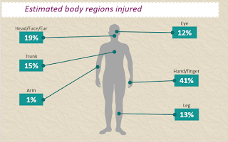 |
| Data call outs for infographics in PowerPoint |
You may like these callouts. In fact, it is a rectangle and a line with circles at the ends.
-
- First, you create a rectangle or you can reuse indicator from your bar chart.
- Create a line. Make it bold, and set arrows as circles.
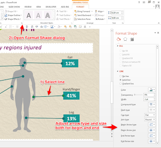 |
| How to create data call outs in PowerPoint |
3. Important little detail. Line color should be a bit darker or brighter than the box.
Summary
I hope you will find it useful. Let me know if you have any questions or problems when you create your infographics in PowerPoint. I read all the comments and emails.
The complete tutorial is available as video screencast:
Visualizations from www.infoDiagram.com


