Using Hand Drawn Graphics in Your presentation: Why and How
Kids love drawing at an early age. From doodling with crayons to later learning and utilizing other utensils, we’re innately drawn to art and want to create it.
Unfortunately, as in the case of young children, adults are not all equal in the artistic ability department. That is one of the reasons why our master designer Izabela, started creating these Hand drawn presentation graphics.
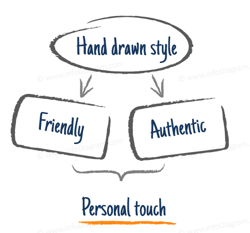
We want to help people who don’t have the time and skills to draw their own graphics. To allow everybody to create presentations with this visually engaging handwritten style. Our own presentation experience proved to us that various sketched-out graphics catch the eye. Beyond the unconscious pull of artistic elements, there are other motives for using hand-drawn, creative styles when building presentations. Adding scribbled or hand-drawn diagrams can make your documents look more interesting, and seem more personalized. You can also check out this TED talk by sketcher Sunni Brown about learning the visual language and doodling as a powerful tool.
The Power of Hand-Drawn Graphics
The goal of creating these handcrafted graphics was to allow presenters to give their projects personality and tap into their creative side. We wanted to form a toolbox based on our expertise and feedback from our community to build something you could use for any presentation.
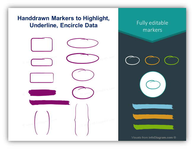
Whether your presentations need charts, graphs, or filled tables – by using a simple hand-drawn mark you can emphasize the details and ideas. That is why our sets include a variety of items such as arrows, lines, circles, charts, graphs, word balloons, and even people who can help illustrate whatever concepts you need.
How You Can Make the Most Impact with Presentation
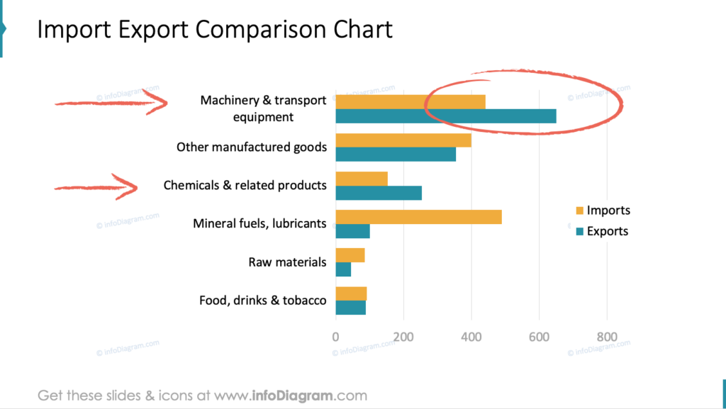
In order to make the most impact, you should follow the path of Presentation Zen by Garr Reynolds. In his book, he recommends that each slide should represent one idea. Even if your slide needs to contain a lot of information to be displayed or a large field of text, you should only focus on one key message to have the most impact. This is true for presentations filled with charts, graphs, tables, or passages of text. When you need to highlight specific, key data hand-drawn elements are perfect!
You can underline information using ovals, point it out using arrows, or utilize speech balloons to accentuate what you need to say. The best part is that design elements are completely customizable so you can make the sketched graphics match your branding or style of presentation.
Four Ways to Use Hand Drawn Graphics in Your Projects
If you are not inspired yet, check out some of the ways we’ve been told people use our handwritten elements and the way we use them every day:
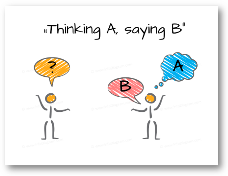
- Underlining Scribbles – (Arrows, ovals, speech balloons, etc.) These are used to highlight information the same way you might if you were working on a tangible, paper document.
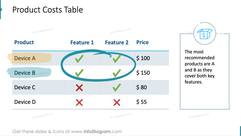
- Illustrative Icons – (People, charts, etc.) They allow you to visualize your theme. Using these, you can enable people who are unfamiliar with your topic to create a mnemonic association to better remember the topic and content on your slide.
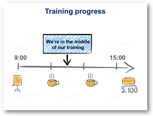
- Progress Indicators – (Timelines) – These are to indicate plans, and projects, or even share the outline of your presentation in an organic way around the progression of time.
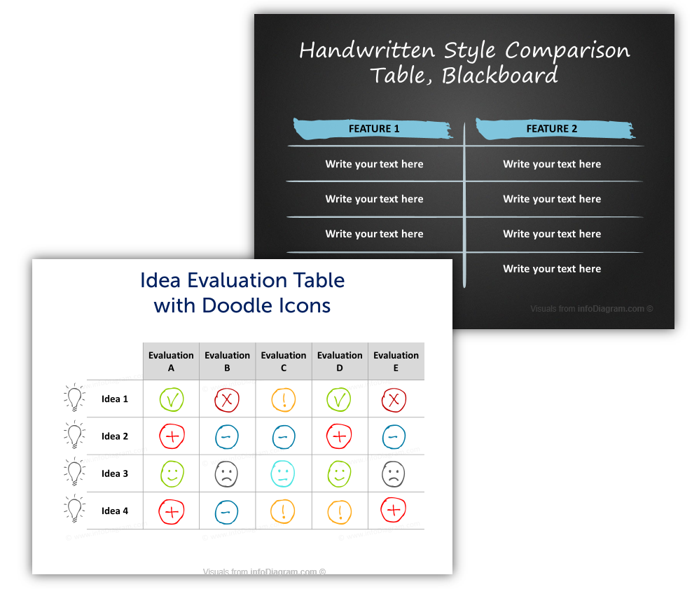
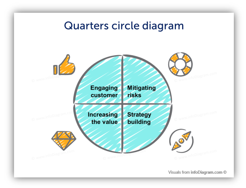
- Diagrams – (Charts, graphs, pieces of charts & graphs) – Alternately, you may use the elements to create your very own charts and illustrations to represent your own process, structure, or relationship.
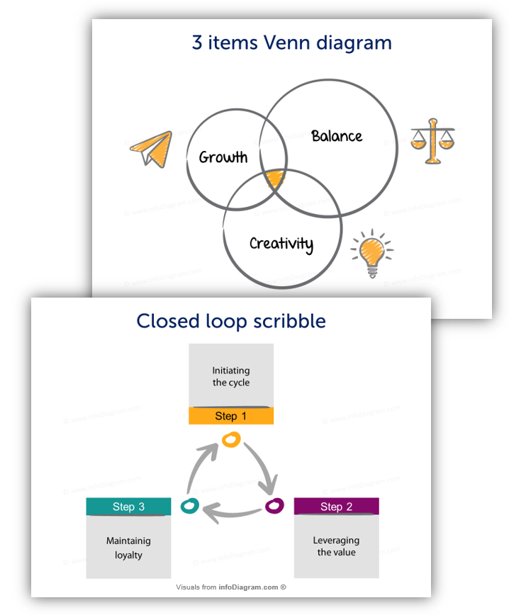
The motive of all of the items in our hand-drawn sets, from lines to pie charts, is to make your presentations more memorable and interesting for viewers.
Using hand-drawn graphics beyond PowerPoint slides
Notice that the title says to use hand-drawn graphics in projects, not just presentations. Although we’ve been talking about how our handwritten icons can be used to embellish presentations, they have also been utilized successfully in eBooks and blog posts.
We use it in many places on our own infoDiagram blog – see scribble illustrations, for example, Seth Godin’s blogs.
If you’re still not sure how to incorporate graphics into your projects, contact us!
Remember the design rules applies also with freehand drawing
Of course, when you’re using any kind of artistic embellishments you need to remember the importance of design consistency. Learn three design hints to make sure your diagrams are professional-looking and remain readable.
Presentations that combine too many style elements can distract the audience. (The goal is to highlight your message and create mnemonic devices for your content, not to detract from it!).
Therefore we suggest
- using one handwritten style per presentation. For example: Only use charcoal or ink style elements, but not all together. The same goes for fonts, stick to 1-2 various fonts max in your presentation.
- Have enough white space. Let the slide breathe – leave margins from the slide edge and don’t put elements too close together.
- And be careful with resizing the elements – keep them proportional, to avoid the “egg shape” effect of circle shapes. With PowerPoint there’s a simple trick – hold Shift key when resizing the vector icon.
Source of Hand-Drawn Graphics
If you need to graphically illustrate a concept or idea, try our handwritten PowerPoint icons and shapes collection. We put there several graphical styles:
- scribble graphics
- chalk or charcoal-style graphics
- pencil style sketchnoting graphics
Our collection of hand-sketched shapes is probably the largest collection of shapes like this available online. We have over 500 handcrafted doodles, and our collection is constantly growing. Browse the bundle collection of hand-drawn PPT graphics here:
We created our hand-drawn graphics sets so we could all have a unique method of highlighting, accentuating, and underlining the key data, points, and messages of slides.
To give you the tools to draw (no pun intended!) attention and focus on important information in a fun and clever way. By making our graphical representation interesting, we are making our presentations interesting as well, and we’re also making them more memorable.
With these instruments, we’re able to strike a chord with audiences in a way we cannot with a standard formal look of printed material alone.
PS. If you are still not convinced, get a free sample of our hand drawn shapes to try first.