Boost Your PowerPoint Slides: 5 Quick Fixes
One of the key lessons I see every day when working with presentations is that people catch visual information way faster than a bold text.
I’ve put down several ways how you can change text information into strong visuals.
TL;DR summary: 5 quick ways to boost your presentation slides: (1) Replace bullet-point lists with simple shapes and diagrams. (2) Restyle PowerPoint’s default SmartArt so it doesn’t look generic. (3) Turn black-and-white data tables into color-coded, icon-led visuals. (4) Highlight your single main idea so the audience remembers it. (5) Use color and contrast to direct attention. The principle behind all five: people process visuals far faster than text – so every slide should lead with a visual, not a paragraph.
One of the most consistent lessons from 15+ years of redesigning corporate decks: audiences process visuals far faster than text. If you’re a manager, consultant, or analyst staring at a slide full of bullet points the night before a review meeting, these fixes will turn it into something your audience can absorb in seconds, not minutes.
Check out the YouTube tutorial to boost your presentation slides and read on to see a detailed explanation of every step:
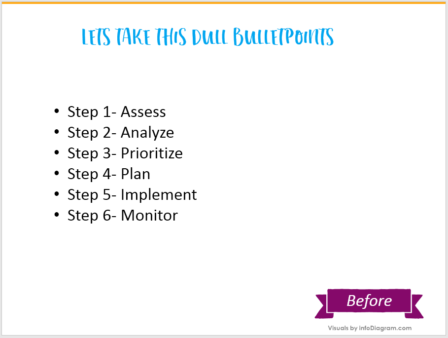
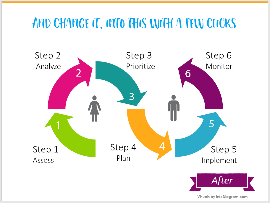
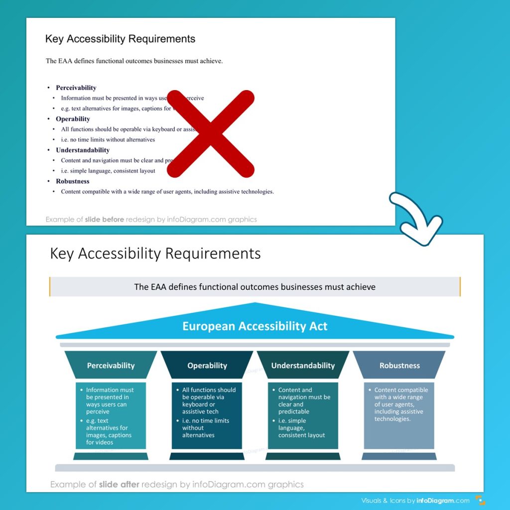
Tip #1 and #2 – Get rid of bullet points and apply diagrams
Take a quick look at this picture. Observe how easily a set of simple shapes can make a boring list catchy and interesting to look at.
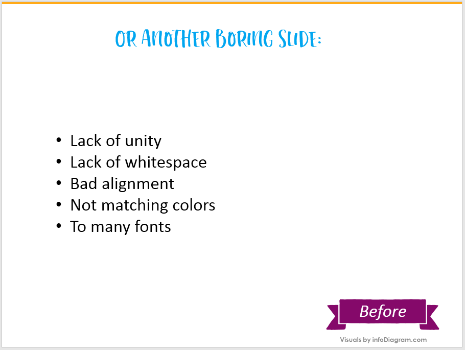
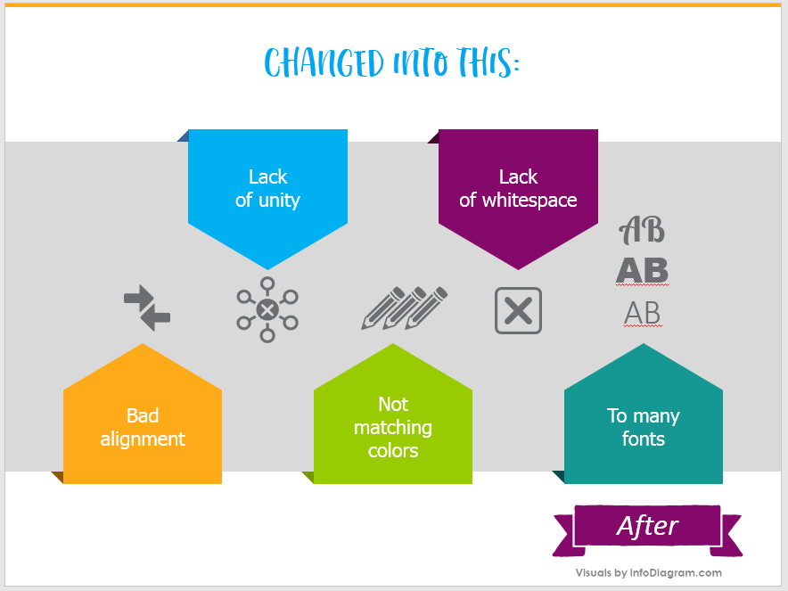
Or another example: how ribbon shapes, colors, and icons can freshen up the slide:
If you can’t remove bullet points from the slide (e.g. you’re presenting an agenda and want to keep it in a flexible list format), check out this blog article Three Creative List Presentation Ideas.
Here are a few more examples of slides where text was replaced by diagram:
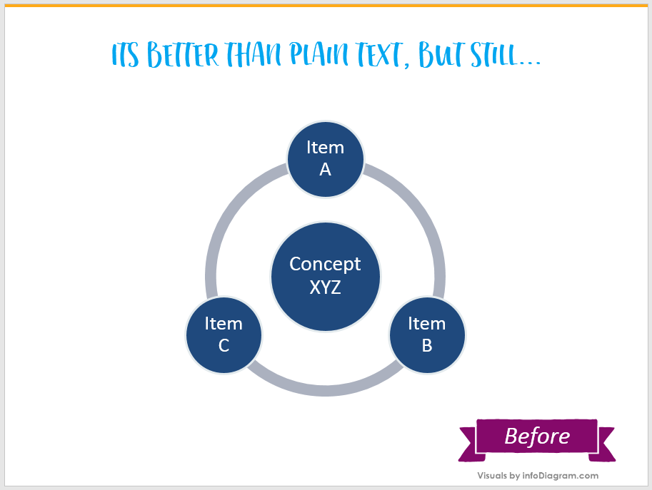
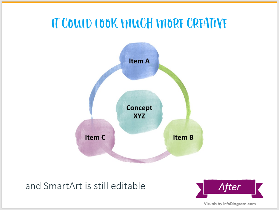
Tip #3 – Give your SmartArt diagrams a creative look
Yes, PowerPoint’s SmartArt diagrams can be truly helpful. They are pretty easy to apply and create. However, their default look is not very attractive. You can be more original and add a creative style to SmartArt:
If you are about to prepare presentation slides for a more serious meeting, the problem can also be solved this way:

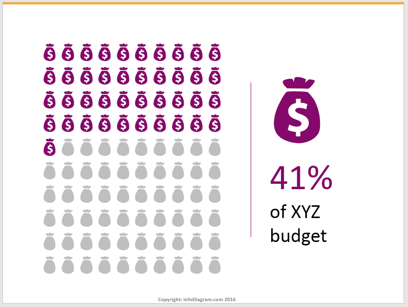
Tip #4 – No more boring default data tables
Avoid plain black-and-white numbers in default tables. Such data presentation shows all data as equally important – and that’s seldom the case. When you present a data, your slide should indicate a story, show visually the meaning of data:
- illustrate the content by icons,
- express good or bad numbers by colors,
- clearly tell
Here’s an idea how you can show visually a numeric data e.g. survey results:
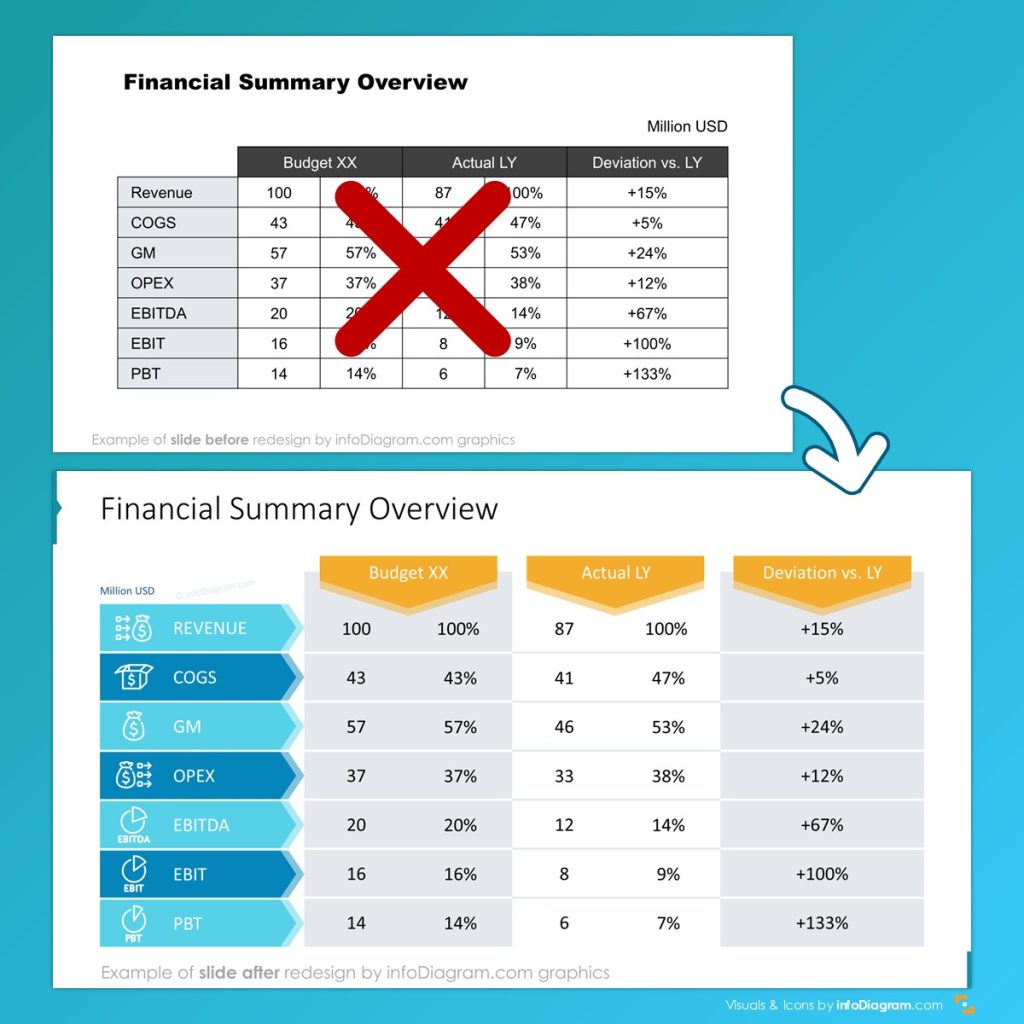
Using a bit of creativity and standard PowerPoint shapes you can do a lot. See transformation of this financial table slide:
Check out four easy ways you can use to quickly change default data tables to more attractive table graphics.
Tip #5 – Make your main idea stand out
Very often our presentations are overloaded with information. For listeners, it is just impossible to remember everything. That’s why the good idea is to remind them about the main point or idea. Below are several unique ways to make your main message be remembered.
It can be a visually separated bottom line comment like on this dashboard slide:

Or if you can put the message in a creative shape that will stand out:

More examples for designing a quote slides are on our another article.
To sum it up:
Follow these steps to freshen up your presentations:
- Use colorful shapes and simple infographics instead of text-only bullet point lists.
- Creatively facelift your SmartArt diagrams, make make them look professional, not generic.
- Apply an innovative way of showing numbers and statistical data. Enhance default tables and charts look.
- Make sure any content you add to your slides is clear and concise.
- Last but probably the most important slide design suggestion – highlight your main idea visually, so it catches the attention of your audience.
Further Presentation Inspirations
Looking for more presentation ideas? Check those blogs:
- Get rid of bullet-points: Three creative list presentation ideas
- How to Create Good-looking Tables in a Presentation
- Too much info on a slide? Simplify Complex Presentation in Three Steps
And if you need event ideas for presentation design on regular basis, check our slide makeover videos on infoDiagram Youtube channel.