PowerPoint Margins & White Space: How to Fix Overcrowded Slides [Design Tips]
Overcrowded slides lose your audience. Learn how to use margins, white space, and padding in PowerPoint to create clean, professional-looking presentation slides.
Curious how you can improve your presentation appearance? There are a few simple tricks that can help make your slides look clean and more appealing. And each will take 5 minutes or even less! This series is inspired by presentations we design and put together by our chief designers.
One of the most often design mistakes is too stuffed presentation slides. In this blog, we’re sharing how to ensure the slides are readable and clear for the audience, so your message can be heard loud & clear.
Explore our Business Performance PPT Reports category on the website for examples of templates to boost your presentation impact.
This article is a part of our Design Tips for Professional Presentation series, see more on our blog. Get our e-book to get six critical design issues checked with examples in one handy PDF:
Inside you’ll find more actionable steps for a professional slide look, including:
- Alignment of texts, charts & tables
- Consistency – how to keep one style through the presentation
- Natural and easy-to-follow reading flow
- How to make 1 main idea stand out
- Spellcheck for a professional reading experience
We also added practical PowerPoint shortcuts that will speed up your work.
So let’s explore one of the tricks that will do magic to your presentation – slide margins. Are they actually that important?
Importance of Slide Margins & White Space for professional presentation look
To make a slide easy to read, avoid placing elements near any of the slide edges. Check if there is enough “white space” on your slides. Make sure there are no graphic elements or text located near the edges of the slide, beyond the margins.

Your slide margins should not be too narrow if you want your slides to look professional. The rule of thumb is 1/20 of the slide width when the aspect ratio is 16:9.

The more white space you will have on your slide, the more professional it will look. Especially the most important point on your slide should stand out. And the more white space you have around that key point, the more visible that point will be.
An overcrowded slide is a sign of a presentation done in a rush, without proper preparation.
How to set slide margins in MS PowerPoint?
We recommend using the PowerPoint guidelines tool to mark the “forbidden” edge area. You can display guides with a keyboard shortcut Alt + F9 or from the top menu: View / Guides.
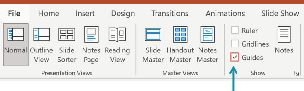
Initially, the guidelines are located at the slide center. Move those lines to the side to mark your slide margins. Copy them by selecting the guideline and moving it while holding the Ctrl key. Below your cursor, you will see a small “+” sign and number stating the distance of the guide from the slide center.
For more inspiration, subscribe to our YouTube channel:
More slide design resources to get you going
If you want to know how you can improve your slides further, check the resources:
- 6 design tips conveniently gathered in an ebook (including this one)
- Consistency in Presentation Design
- 3 Diagram Mistakes to Avoid in Presentation Design
- How to Copy and Adapt Diagrams to Your Content
- 5 Creative Ways to Embed Icons in Your Slide Design
Get our free sample and let’s stay in touch for more tips and resources!