Too much info on a slide? Simplify complex presentation in three steps
Is your presentation overloaded with information and do you want to minimize the amount of text keeping the main message? During slide design or redesign we often face the problem of how to simplify a complex presentation and leave only important information. In this blog, we share here three tips on how we cope with it.
The common problem is how to avoid too ‘wordy’ slides, which are good for reading on-screen if someone has lots of time. But who has it today? Even more, if the slides are to be presented at a meeting, texts on slides are effectiveness killers. However, there is a way to visualize key facts and make them simple and easy to understand for our audience.
Transform your business presentations with our expert resources. Discover more on our business performance presentations webpage.
Follow these three steps when working on your next presentation:
1. Keep only the keywords, eliminate less important “filler words”
Sometimes our presentations are overwhelmed by unnecessary text. Ask yourself, do you need to write a full sentence on a slide? Words on a slide do not have to be in the form of spoken text. It’s not a book to be read. Narration should be told, not read on the slide. Let’s see some examples:
- A sentence with a list of items can be changed to a list of bullet points.
- Words “and”, “example, instance”, “and more”, can be changed to shorter forms “&”, “e.g.”, “…”
- Words expressing the consequence “because of this”, “therefore that”, and “which implies” can be replaced by a graphical way showing the consequence – a simple arrow can do.
- Repeating subjects over several statements can be changed to one subject with a sublist of statements. So you mention the subject only once.
Next time you’ll be working on slides, try to analyze them and decrease the amount of information, saving only the keywords, that carry the main thoughts. It may not be easy, as we tend to think everything is important. However, try doing this exercise more often and you’ll notice the progress.

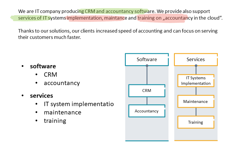
See on the picture above how we underlined only the keywords that should stay on a slide. All the rest can actually be removed. Those details can be explained by the presenter, not necessarily written on a slide.
After this underlining exercise, you can change the keywords to a list of points that are easier to read. And then turn that list into an effective good-looking infographics, so keep on reading 🙂
2. Express the text essence with diagrams
The next step is to replace the keywords you chose previously with the set of shapes, or create simple diagrams instead of texts. Using graphics instead of blocks of text is a great solution when you want to create attractive-looking slides.
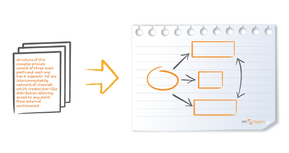
Creating a diagram from scratch is pretty easy. You can design it using simple shapes – rectangles, ovals, arrows. See the symbolic picture below.

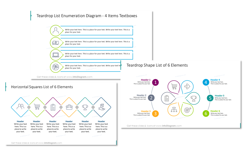
If you have more time, you can make them more sophisticated:

Check more types of diagrams you can use in this article: 18 Visual Diagram Categories to Cover Major Structures and Processes.
Another way to approach diagrams is using PowerPoint’s tool called SmartArt which allows you to explore some basic diagram forms.
3. Split content into more slides to get space

If you feel you definitely need to present all the information, if you cannot reduce it, then this simple trick will help you. Break the text into two or three slides so a slide is less overloaded.
This will allow you to create more space and make your slides more visual. You will have space to use graphics and explain your points more effectively.
If this results in a longer presentation, don’t worry. There are ways to organize slides in a readable form. For example – use structure slides (e.g. title slide, section break slide – see examples in this blog post) as eye-catching “splitters” of your presentation. Avoid putting too many same-looking slides one after another.
Here are ideas on how you can use the new space on the slide, once you have less content:
- add illustrative pictures to express emotions or create visual associations. See our tips on how to find and choose the right icon.
- use markers to highlight the key text parts, as in the slide picture below
- consider adding a personal touch to slides, using doodled shapes, sketched symbols and hand-drawn pictograms
Try following these three steps, to make your next presentation truly engaging and impressive for your audience.
If you’re still stuck with your presentation, reach out to us. We can propose several ideas on how you can illustrate your concept on a slide.
For more inspiration, subscribe to our YouTube channel:
Further articles on presentation graphics
For more inspiration on using visuals in your presentations, check out these articles as well:
- Five Creative Ways to Embed Icons in Your Slide Design
- How to Get Creative Sketchnoting Your Slides
- Ideas for Writing Eye-Catching Title for Your Presentation
- 3 Mistakes to Avoid in Diagram Design
- How to Create a Hierarchical Chart Example


