Save time on presentation design using those PowerPoint instructions:
Content
- Icons replacing
- Diagrams editing
- Copying graphics into your presentation template
- Photos editing
- Data charts editing
- Tables editing
- Changing color palette
Want to learn more? Join our online training in PowerPoint slide design – check upcoming dates here.
1. How to replace an icon
- Find a new icon you want to use, e.g., from our icon sets presented at the end of the presentation or from a specific icon set product.
- Select that new icon and copy it to the clipboard [Ctrl+C].
- Go to the slide where you want to replace the icon.
- select the original icon you want to replace,
- if the icon is grouped together with other elements, ungroup them first to select only the icon [Ctrl+Shift+G],
- remember the style of an old icon, using Format Painter [Ctrl+Shift+C],
- remove the old icon by deleting it.
- Paste a new icon to the slide from the clipboard [Ctrl+V].
- Position the new icon to the desired place and apply the remembered style of the old icon using Format Painter [Ctrl+Shift+V].
More inspiration here:
- Five Creative Ways to Embed an Icon in Your Slide Design
- How to Find the Right Icon and Use It
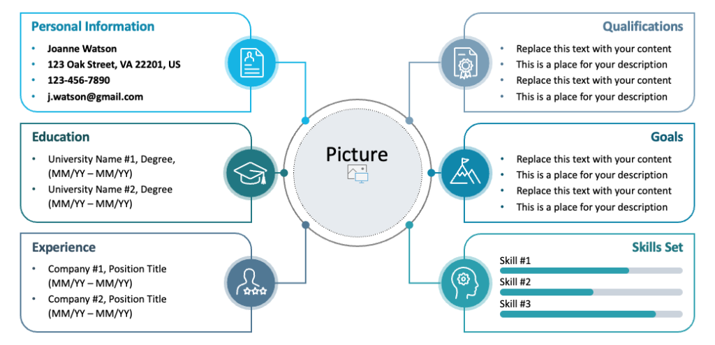
2. How to add or remove diagram element
- Go to the diagram you want to modify.
- Select the diagram element you want to remove or multiplicate. To select the element, you may need to ungroup the diagram first [Ctrl+Shift+G].
- Remove it, or copy [Ctrl+C] to extend the diagram by the same element. Create a new element by Pasting [Ctrl+V] as many times as many elements as you need.
- You may need to reposition the updated diagram to be centrally positioned. To make it easier, select all diagram elements and group them together. Then, adjust the position of the whole group.
More inspiration here:
3. How to copy graphics into your presentation
Scenario 1 – you want to copy only the slide content, not the whole slide:
- Go to the source infoDiagram slide. Select all graphics elements you want to copy.
- Copy selection to clipboard [Ctrl+C].
- Go to your presentation.
- Paste a selection from clipboard [Ctrl+V].
- If you want to keep the original style (colors), use Paste Special from the top menu [Ctrl+Alt+V] & choose Keep Source Formatting.
Scenario 2 – you want to copy the whole slides:
- Go to the source infoDiagram slide. Select a slide or several slides you want to copy.
- Copy slides to clipboard [Ctrl+C].
- Go to your presentation.
- Paste slides from clipboard [Ctrl+V].
- If you want to keep the original style (slide background, palette colors), use Paste Special from the top menu [Ctrl+Alt+V] and choose Keep Source Formatting. Be aware that this will add a new Master Slide Template to your presentation, which will contain various slide templates inside.
More inspiration here:
- How to Copy and Adapt Diagram to Your Content
4. How to replace photos in PPT template
Scenario 1 – presentation contains a slide template with a picture placeholder
- Select and delete the existing picture.
- Click on the icon in the middle of grey placeholder
- Choose your picture. It will be stretched to fill the placeholder with untouched aspect ratio.
- You can adjust the new image to the placeholder by right-clicking on the picture and selecting the Crop action from the dropdown context menu.
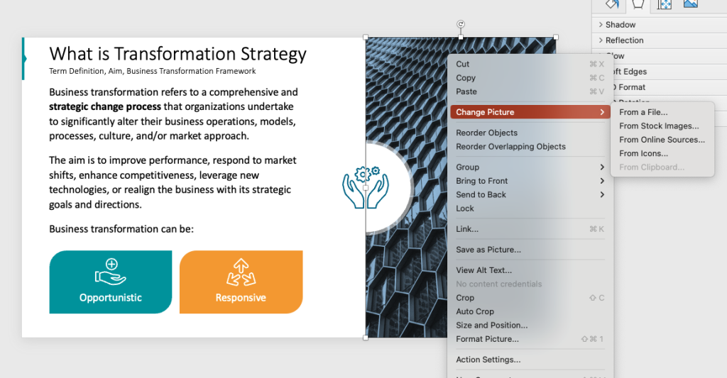
Scenario 2 – presentation doesn’t contain a slide template with a picture placeholder.
- Right-click on the picture and choose Change Picture from dropdown menu then From a file.
- Choose a new picture but beware it has to have exactly the same dimensions to fill the original photo space 1:1. Otherwise it will appear smaller to fit the original image container.
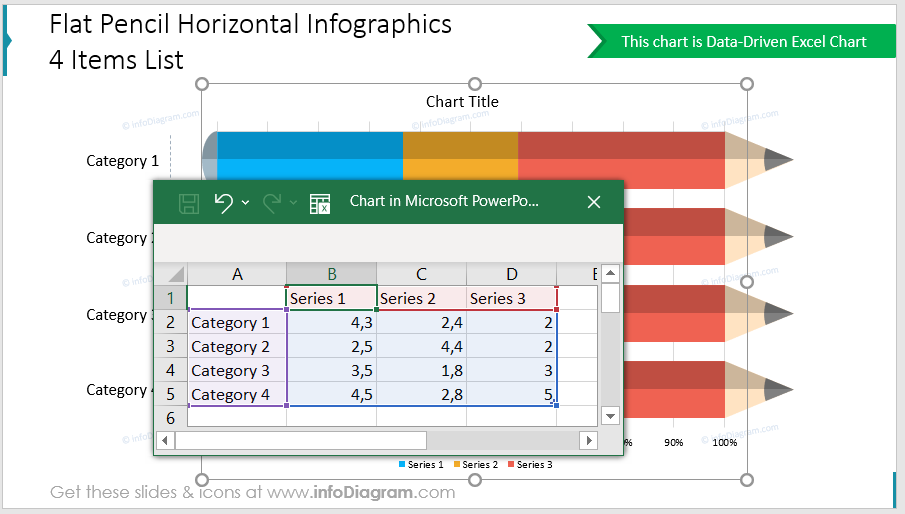
5. How to edit data charts in PowerPoint
This concerns all data-driven charts, which are MS Office chart objects (the same as Excel charts). Please note that some of our data charts contain additional not data-linked graphics, so those need to be adapted manually. Unfortunately, that’s the price for adding atypical chart decorations, as MS Office charts have limited editing options.
- Select the data chart in your PowerPoint – by clicking the right mouse button on the data chart.
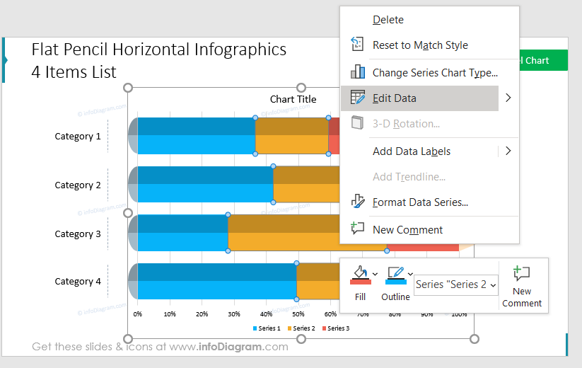
- Select Edit Data from the pop-up menu. This will open an Excel sheet window with data you can edit. You can modify values there to change the data chart – you should see changes immediately. This data sheet is embedded inside the PowerPoint file and will be copied with the chart.
6. How to add columns and change colors in the PPT table
To add a column to the table:
- Click on the table to select it and choose the top menu tab: Table Design / Layout / Insert Left or Right.
- You may need to adjust overlay shapes after that.
Replacing colors inside the table: It depends on the shape or table, but everything should be easy to edit:
- Click on shape or table cell.
- Choose a cell background color or shape fill color from the appropriate top menu.
- Alternatively, you can change the whole presentation colour palette in the top menu: Design / Variants / Colors.
More inspiration here:
- 4 Steps for a Good-looking Table in a Presentation
- How to Beautify a Table in PowerPoint
- Make Infographic Tables Stand Out with Colorful, Flat PowerPoint Design
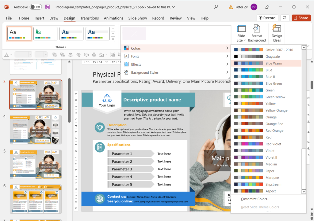
7. How to change the color palette of the master in our PPT template
One way is to select the Design tab and change the color palette to one of the offered. Alternatively, you can customize your own. Notice how the color of the top ribbon changes from orange to another color.
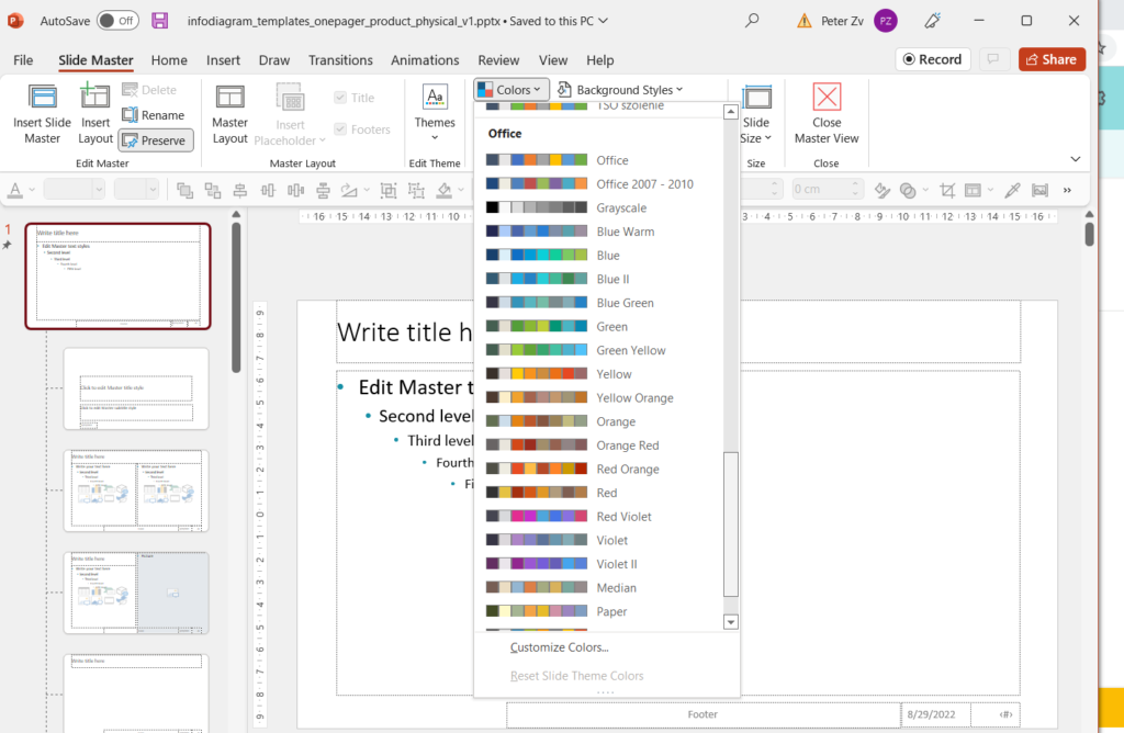
Optionally, you do the same when you enter View / Slide Master / Colors in the Slide Master top menu:
More inspiration:
Check the following blogs for more design tips and tricks to save time while working on a presentation:
- How to Deal With Overcrowded Presentation Using Slide Margins in PowerPoint
- Order Chaotic Slides with Align & Distribute PowerPoint tools
- Avoid Messy Slide Look by Following Consistency Hints
- How to Draw Attention to the Main Message on a Slide
Want to learn more? Join our online training in PowerPoint slide design – check the upcoming dates here.
Need more help?
If your issue isn’t addressed here, use the orange bubble at the bottom left corner to send us a message or email us. We’ll do our best to answer all requests; however, it can take a few hours.
Want us to do a presentation modification for you? Check our Custom Design services here.
Your infoDiagram team
