Presenting Timeline Using Infographics Diagrams
Are you presenting timeline or time sequence information? It can be a process description, a company history, or a procedure explanation.
Here are some examples of how you can change this text information in a visually attractive way.
Basically, all you need to do is to apply two steps:
1. Replace text with timeline diagram shapes
The simple trick is to separate time events from your text and put each one into a separate shape.
You can use the SmartArt tool for quick work or you can create your own shapes – this will look less default. For example set of simple rectangles or circles or combined shapes like the ones below:
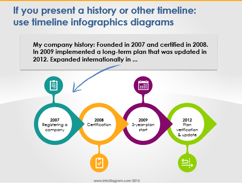
2. Illustrate timeline shapes to create simple infographics
Having a set of basic shapes in order, you can go on and add some illustrations – arrows, icons, and graphical style to the shapes. So they create a nice compact simple infographics illustration.
Just keep it consistent. Use 1-2 fonts, one icon style (e.g. modern flat symbols or hand-drawn pictograms), and consistent color palette.
Check the full presentation with timelines infographics diagrams and shapes, published on Slideshare below:
You can create such shapes yourself from basic PowerPoint shapes. Or get the ready-to-use predesigned Infographics Diagrams PowerPoint Slide Set.
Further reading on using diagrams instead of text slide:
This article is Part II of the series “Replacing Text Slide with Infographics Shapes”. See the other two parts:
- Using Timeline diagrams infographics
- Presenting Key Data Values on a Slide
PS. Let me know what’s your biggest challenge with presentations?
Comment or write to me directly via the Contact page. I will be glad to share some advice.