Designing Appealing Office Management PowerPoint Visuals [slide makeover]
If you need to illustrate the office management tasks or documents processing check out our slide makeover example.
Organizing work of the company office involves various activities, from ensuring office supplies for all employees, to managing a document flows and sometimes also assisting in HR processes.
To keep your next presentation simple yet bright and attractive, you can add a set of visual symbols to illustrate your slide content.
Finding an appropriate symbol for the abstract business concepts is not always an easy task.
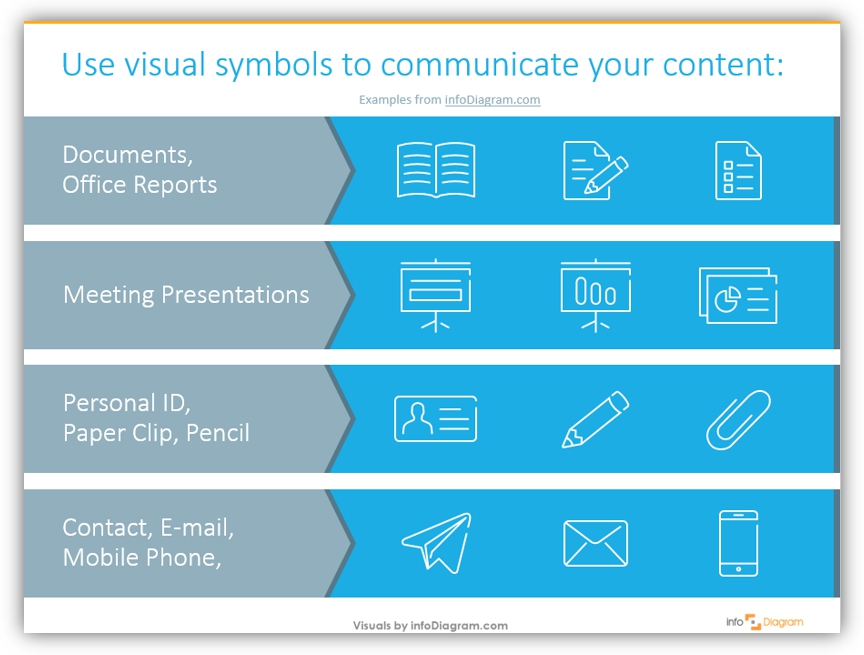
Office & Documents Icon Ideas
We have put together visualization ideas you can use to present office and documents-connected topics. They are grouped into 4 groups:
- Documents and Office Reports: can be showed with a classical ToDo list, an open book and a pencil with a note.
- Meeting Presentations: take a flip chart symbol and use your imagination – e.g. we put a bar diagram icon and a title slide pictogram, you can use other according to the topic of the meeting.
- Personal ID, Paper Clip, Pencil: if you’re giving a presentation about personnel registration policies in the office or stationery supplies, those icons will help you.
- Contact, E-mail, Mobile Phone: those images are useful for any presentation slides – whether it is an external session or meeting with partners.
Download all the icons and diagrams from Outline Business Icons for infographics collection.
Compelling Office Management Visuals – How to properly use them
After you choose the icon properly representing your points, it’s worth to remember a few good design rules for slide creation if you want it to look professional:
- Illustrate the main concepts only if you don’t have enough space on the slide. Don’t make your content too dense.
- Use a consistent set of icons, the same graphical style (all outlines, or all multi-color ones. Avoid having a mix of symbols, one with shadow, another black & white and another in color).
- Ensure the diagram is smoothly readable: align all shapes with enough white space. See this blog “3 Diagram Mistakes to Avoid in Presentation Slides Design” for practical examples.
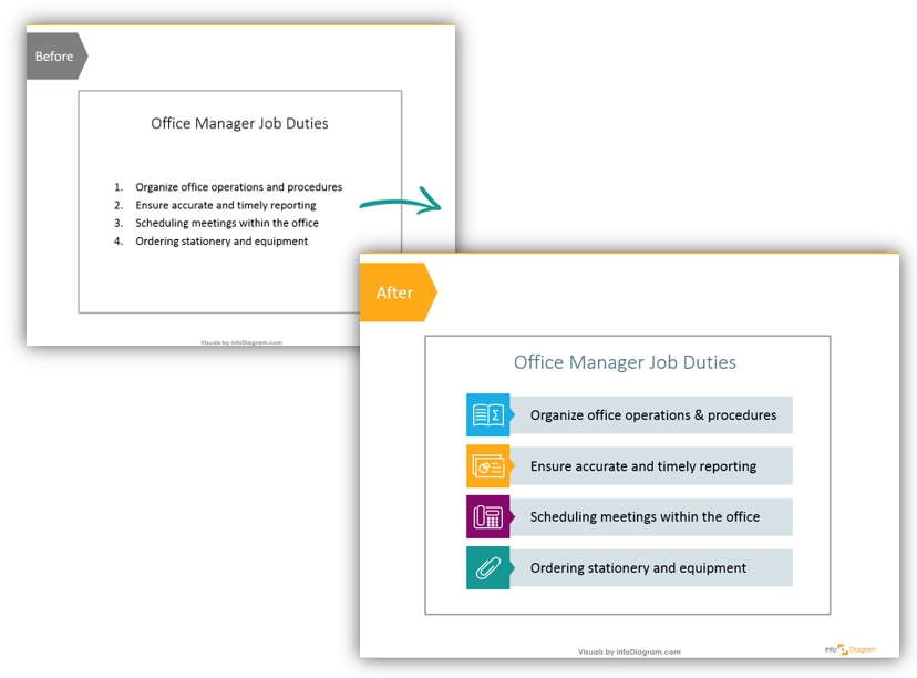
Example of the Office Manager Duties list redesign
We know using icons will freshen-up your slide. Let’s see how you can use them inside some interesting layout.
Here’s how you can make a slide with an ordinary bullet-point list of office manager tasks look more visual and professional:
1. Replace List with Simple Shapes
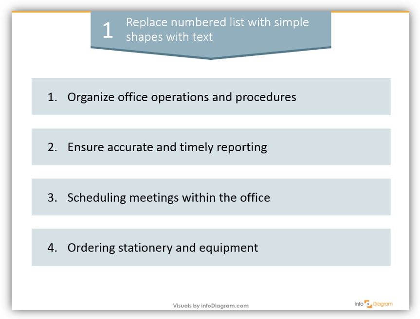
Ok, we agree that it looks better than the first version of a slide – a simple bullet-point list. However, it is far from nice-looking graphics.
We used large rectangles, which are slightly grey so that the texts are better visible. Remember about the alignment and slide margins, don’t put graphics too close to the edge.
2. Create Additional Elements
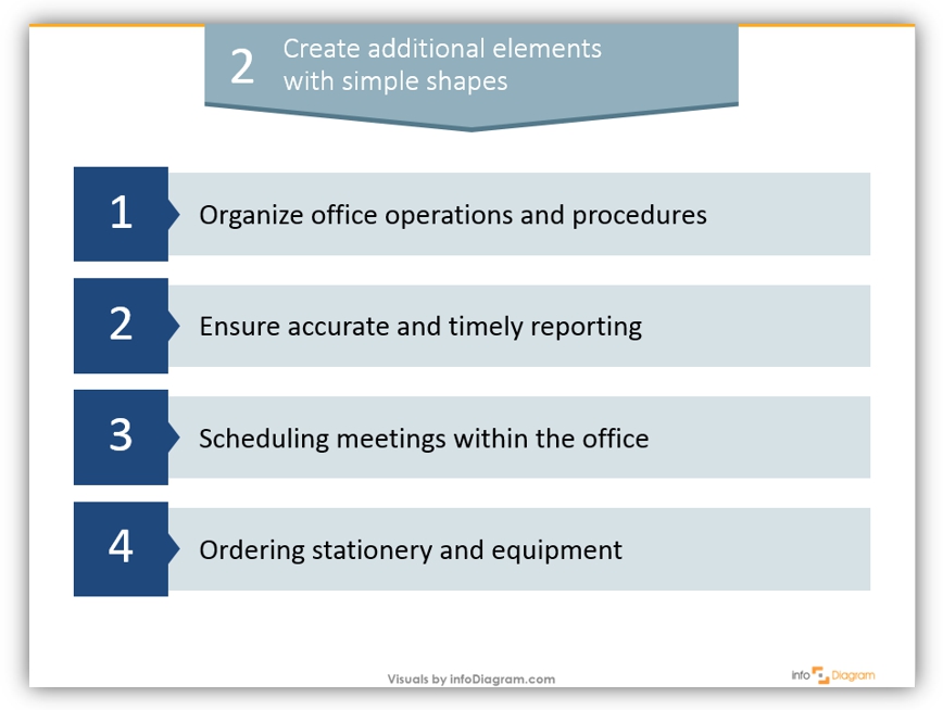
With simple shapes – squares and small triangles – the slide looks like somebody was working on it 🙂 Is it everything we can do to make it look better?
3. Add Icons and Colors
The last step is adding colors (but you can stay with one or two, not paint every line in a different color if you prefer less vivid look). And finally add outline icons, illustrating each of four office management duties:
- Organizing operations can be represented by a book, or a box, or connected puzzles.
- For reporting, you can use an icon of a presentation slide, a chart symbol or other kind of formal document picture,
- For meeting schedule, we used a phone symbol here, but a calendar icon would do, too.
- The ordering of office supplies and office equipment can be illustrated by a paper clip – probably the most common office supply item. Alternatively, you can choose a symbol of a pen or pencil.
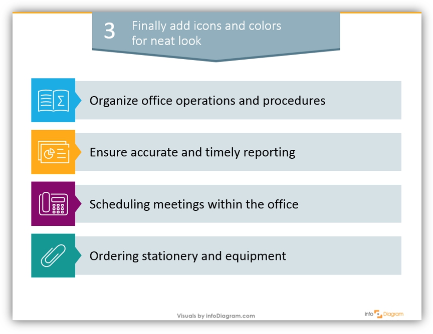
That is the final version of our slide. Looks better, than the very first version, doesn’t it? 🙂
Remember that it’s also important to have a balance and not overdo with various elements (lines, shadows) on a slide.
To summarize:
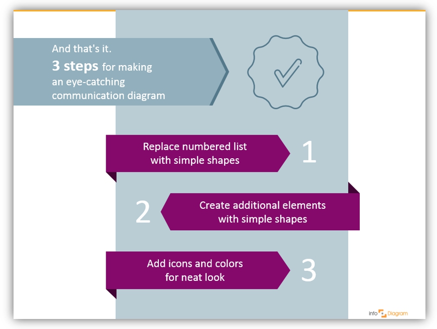
We made this neat chart just in three simple design moves. Even if you’re not a designer, try applying your creativity and speaking a visual language.
We wish you inspiration and don’t be afraid to experiment!
Graphics and Reading Resources
- How to Make Modern Organizational Chart in PowerPoint
- Abstract concepts visualization ideas: Business concepts visualization list for better PowerPoint slides
- 4 Ways to Improve a Chart – data visualization
- Outline Business PPT Icons:
If you like the icons and example diagram above, you can get the symbols collection we used (or subscribe and download slides every month):
Should you need help with choosing or using our PowerPoint graphics, let us know here. We will gladly assist.