Last Updated on September 9, 2022 by
Do you need to make a data-driven PowerPoint presentation more engaging? Eye-catching visuals can help your audience understand figures, progress, and make data comparisons. MS Office and PowerPoint have basic bar chart templates you can use, but they lack uniqueness and creativity. Professional, modern PPT graphics offer an attractive alternative that will make your presentations more memorable.
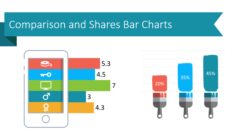
Presenting data doesn’t have to be boring! Our designers created the Creative Comparison and Shares Bar Charts slides collection so everyone can make eye-catching informative slides. Check out the full set to get inspired for your next presentation.
Use Pencil Bar Charts to Present Multiple Categories
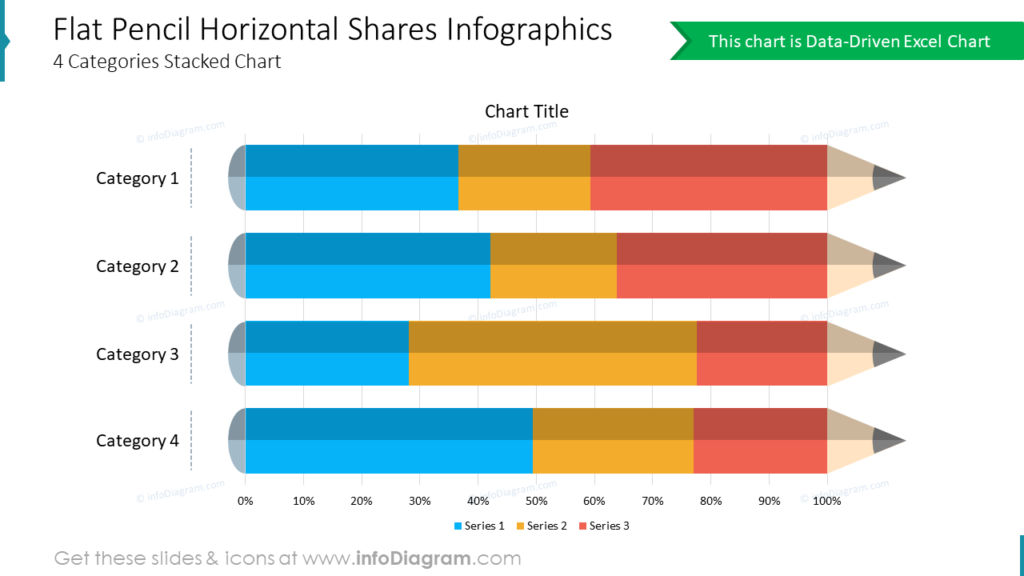
Are you presenting data which needs to be divided across categories? The data-driven Flat Pencil Hori-zontal Shares template is a creative alternative to basic Excel charts. The colors and labels can easily be customized to suit your purposes. This modern-looking, stacked bar chart alternative will help your audience understand and recall the information you present.
Paint Brush Strokes Make Exceptional Progress Bar Indicators
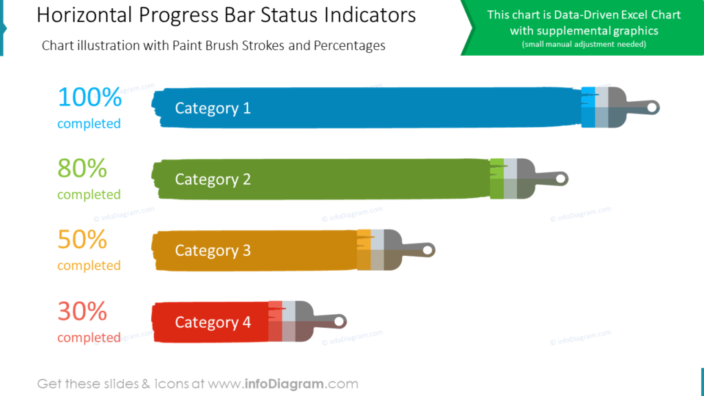
Why use boring graphics? MS Office bar charts do not look interesting and are easily forgotten. Colorful, data-driven Excel charts like these immediately draw your eye to the data. Adding paintbrush strokes makes your PPT slides beautiful and easy to understand. All of the customization necessary to get this slide ready can be done using MS Office tools. Our designers made it easy for you. You do not need special software or graphic design experience to make user-friendly, impactful charts for your PowerPoint presentations.
Spice up Horizontal Bar Chart
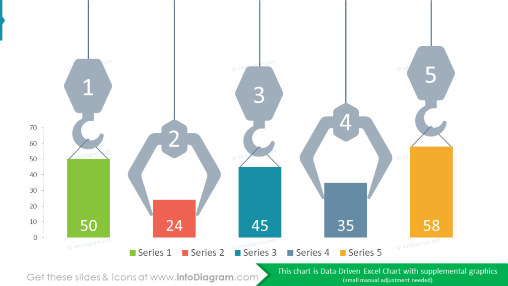
The Creative Comparison and Shares Bar Charts set doesn’t only contain horizontal bar chart alter-natives. In the example, the data-driven Excel chart has been embellished with supplemental graphics. The crane hooks and claws all help draw your audience’s eye to each series bar. The colors can be modified to suit your company, audience, or your message using the tools in PowerPoint.
A Guide for Creating Unique Bar Charts
Replace generic MS Office bar charts with creative, easy to build alternatives. Your PPT slides will look exceptional if you follow these simple steps.
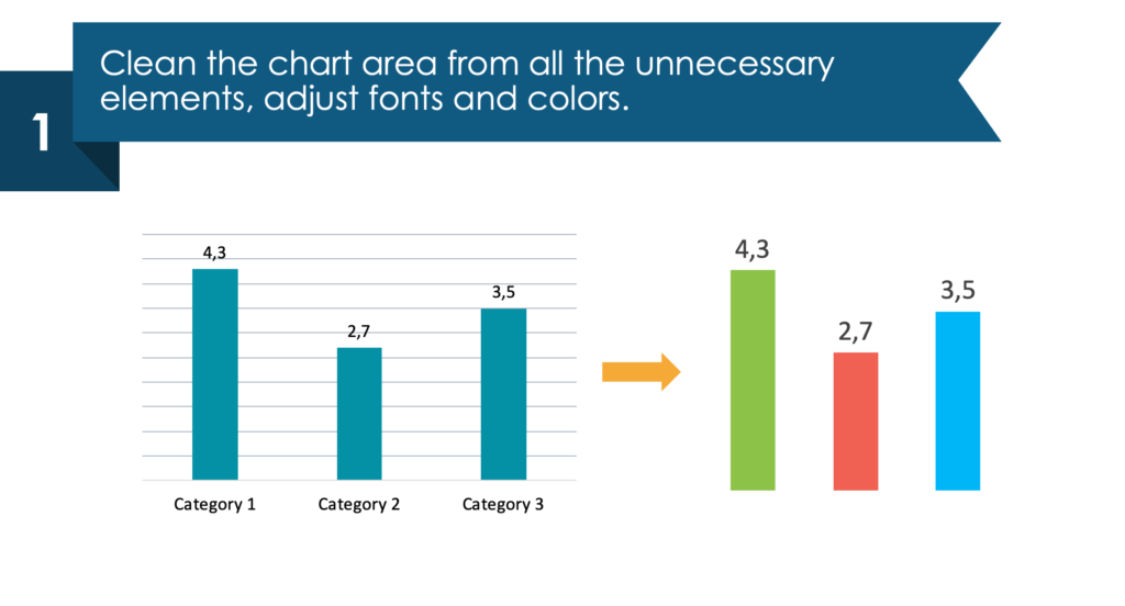
1. Clean up the chart area. Remove all the unnecessary elements, adjust the fonts and colors.
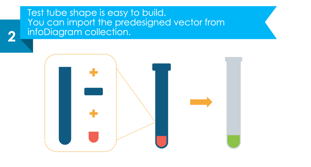
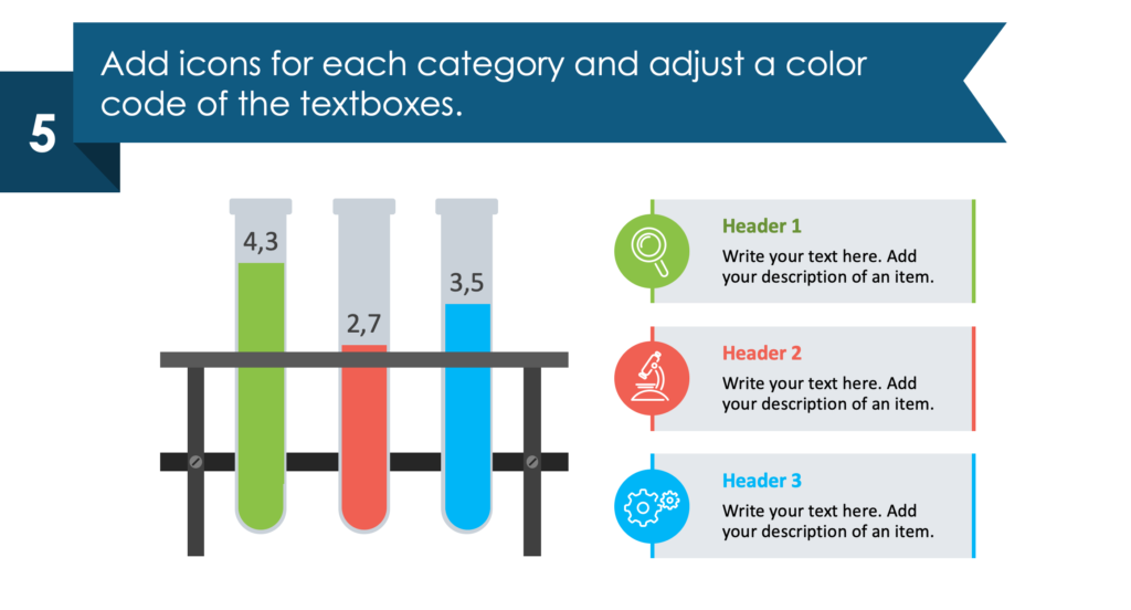
2. A test tube shape is easy to build (you can import the pre-designed vector from the InfoDiagram collection.)
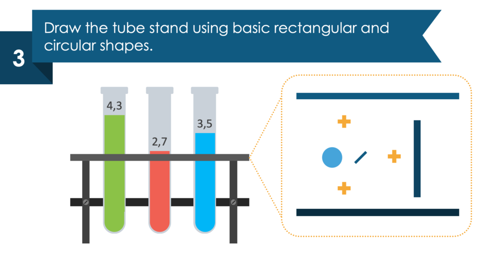
3. Draw the tube stand using basic rectangle and circular shapes.
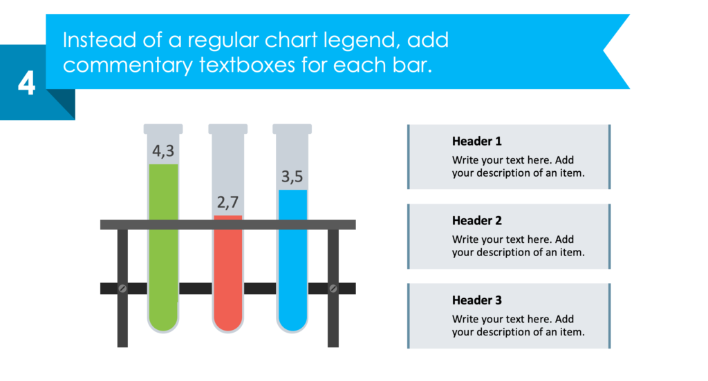
4. Instead of using a regular chart legend, add comment-style text boxes for each bar.
5. Add icons for each category and implement a color code for the text boxes.
Resource: Creative Comparison and Shares Bar Charts
Whether you use test tubes, ribbons, paintbrushes, or one of the many other visual metaphors included in the Creative Comparison and Shares Bar Charts, you will have a striking presentation. Each PPT slide you create should be professional and easy to understand. By using pre-made PowerPoint graphics you can save time and be sure your slides fit the bill.
It can be difficult to come up with creative ideas for each presentation you make. We created the Comparison and Shares Bar Charts set to make sure everyone has access to simple informative graphics for their PPT slides, see the full slides collection here:
Creative Comparison and Shares Bar PPT Charts
Want to do even more customizing? Graphics from the collection of professionally-designed editable diagram templates might help you take your next PowerPoint further.