
Data Visualization Makeovers: 2 Steps to Better PowerPoint Charts
In the context of global business presentations I often work with, your data…
In the context of global business presentations I often work with, your data…
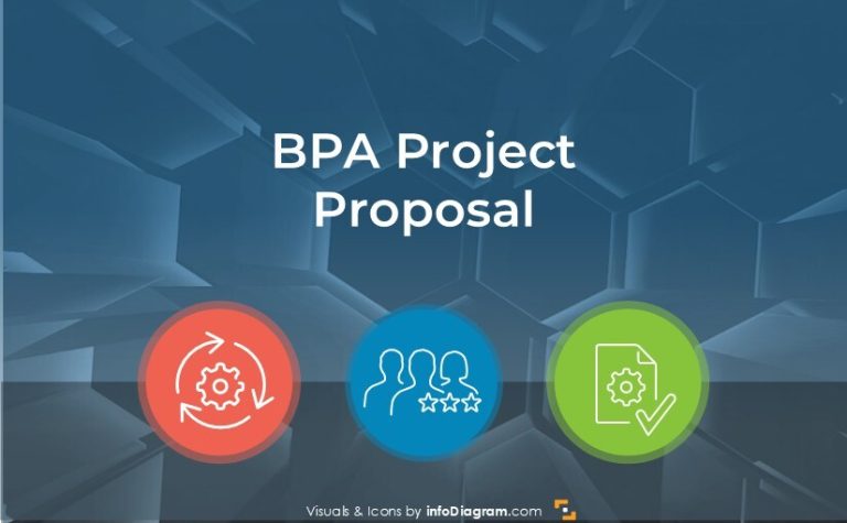
If you need to present or pitch a Business Process Automation (BPA) initiative…
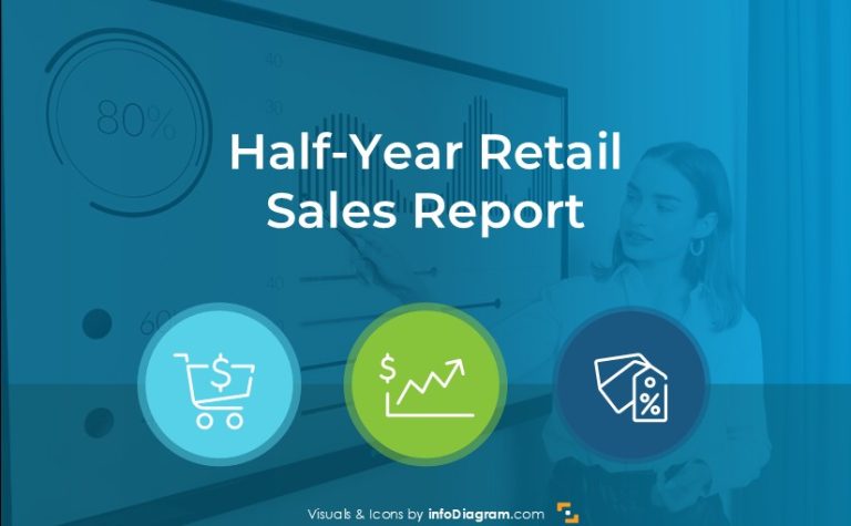
Are you about to present a retail sales report? Retail companies usually need…
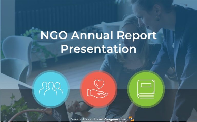
Do you want to present your NGO or non-profit annual report a way…

The summer period of a business calendar despite low season for most companies,…

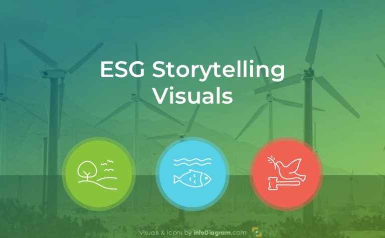
Are you about to present topics of ESG? In the following article, we…

When looking at a business calendar, the month of May covers several events…

If you need to teach or explain what is the Non-violent Communication model…

Measuring and communicating employee experience is a powerful HR motivation tool. It helps…

When presenting a complex landscape of modern HR systems such as HRIS, HCM,…

When you want to present a market analysis of a specific country, using…
Month of April contains several important business events that can be reflected in…
If you want to talk about future directions in human resources, such as…
March is packed with opportunities to align your business presentations with global events.…
Do you prepare for the onboarding meeting with your new employee? Create a…

Are you looking for ways to present an IT security project to a…
Are your 1:1s meetings with your employees as effective as they can be?…
Need to present insights of your CapEx performance, or evaluate capital expenditures? Get…
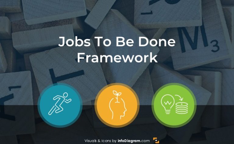
Do you need to present the JTBD framework? Explain the Jobs to Be…