
Eye-catching ways to present Debtors AR report in PowerPoint
Do you need to present your debtors accounts receivable status and analysis of your debtors? Show your data with easy to read visualizations in an understandable and eye-catching format.
Get new, creative ideas on how you can prepare a presentation for debtors analysis or company financial reporting.
Typical debtors or AR report will likely cover those areas:
- Bad Debts Risk Mitigation Strategy
- Customer Creditworthiness Evaluation
- Receivables Performance Analysis
- Accounts Receivables Dashboards
- Debt Recovery Measures
Let us show you examples of how such presentation slides can look like.
Get all the graphics presented here – click on the slide pictures to see and download the source illustration. Check the full Debtors Analysis AR Financial Report Presentation (PowerPoint Template)
Present strategy of healthy account receivables situation
An example of AR strategy can include those points:
- Customer risk assessment
- Prompt payments stimulation
- Outstanding invoices monitoring
- Overdue payments control
- Debt recovery measures
You can illustrate them as visual flowchart like we did here:
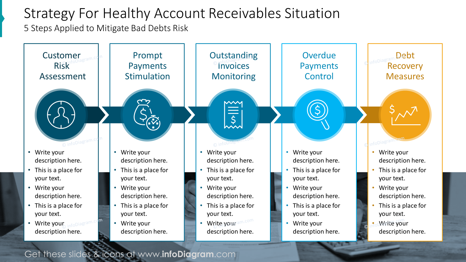
We placed key information from each stage in a separate box and added arrows between them to show the flow. Take a look at colored circles placed on the arrows you can see there icons that support visually every step of the process.
Presenting FICO model score based assessment of debtors
To show score allocation and creditworthiness of your debtors, you can present them with a series of data charts.
However, such dashboard slides with multiple charts require special attention to stay readable. See how you can present such FICO score data:
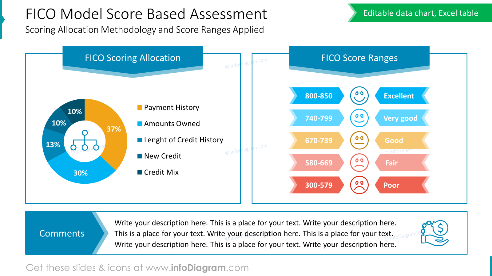
We used here two columns layout for two main points:
- FICO Scoring Allocation
- FICO Score Rangers
To separate those columns and add a structure we used frames. In the first frame there is a pie chart showing FICO Scoring Allocation – you can place a representative icon inside such a chart, to express the visualized data . On the other frame you can see score range divided into five levels from Poor to Excellent one. To give it a more eye-catching look, every level is illustrated by icons with smiley faces from sad to happy.
Presenting customers distribution charts by FICO model can have a form of stacked data chart, comparing last and current year:
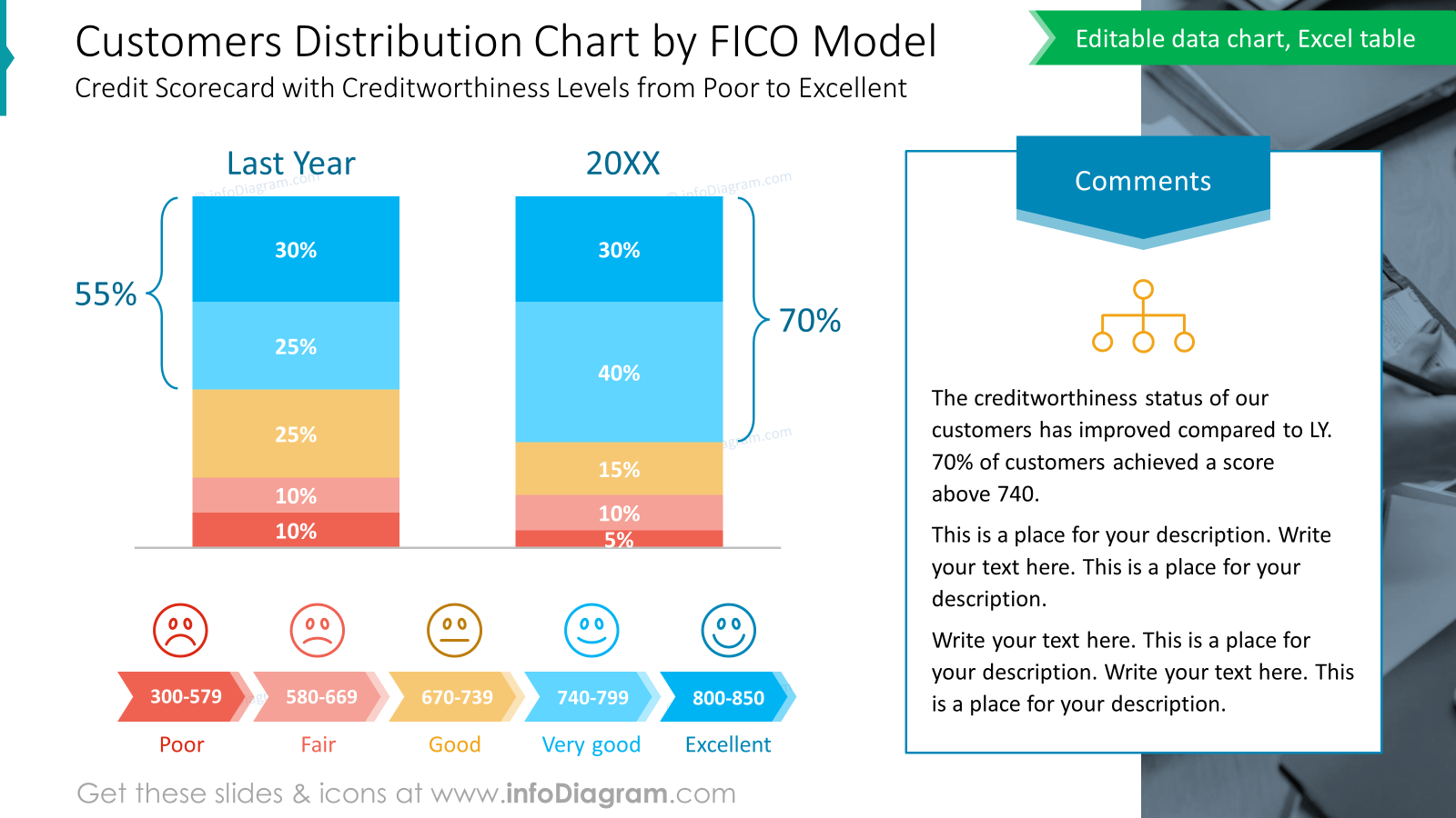
Notice column chart with last and current year data.
To make such presentation slide more attractive, we added handcrafted legend in the form of flowchart, illustrated with icons. Can you see the color and shape consistency with the previous slide?
If you want to express two top creditworthiness levels, you can highlight them by placing brackets and adding total value of those two levels.
It’s good practice to also add a commentary of presented data, especially if you prepare a presentation that will be sent as a report. Notice how we proposed to visualize it – on the right side of slide there is place for explanation.
Defining key financial metrics DSO or Bad Debt
If you need to explain receivables performance analysis to people who are not 100% familiar with all the terms, it’s good to remind them those essential financial metrics formulas of:
- what is Debtor’s Ledgers
- how to calculate Days Sales Outstanding
- definition of Bad Debt Ratio
- calculation of Collection Effectiveness Index
Presenting debtors analysis formulas can look like this:
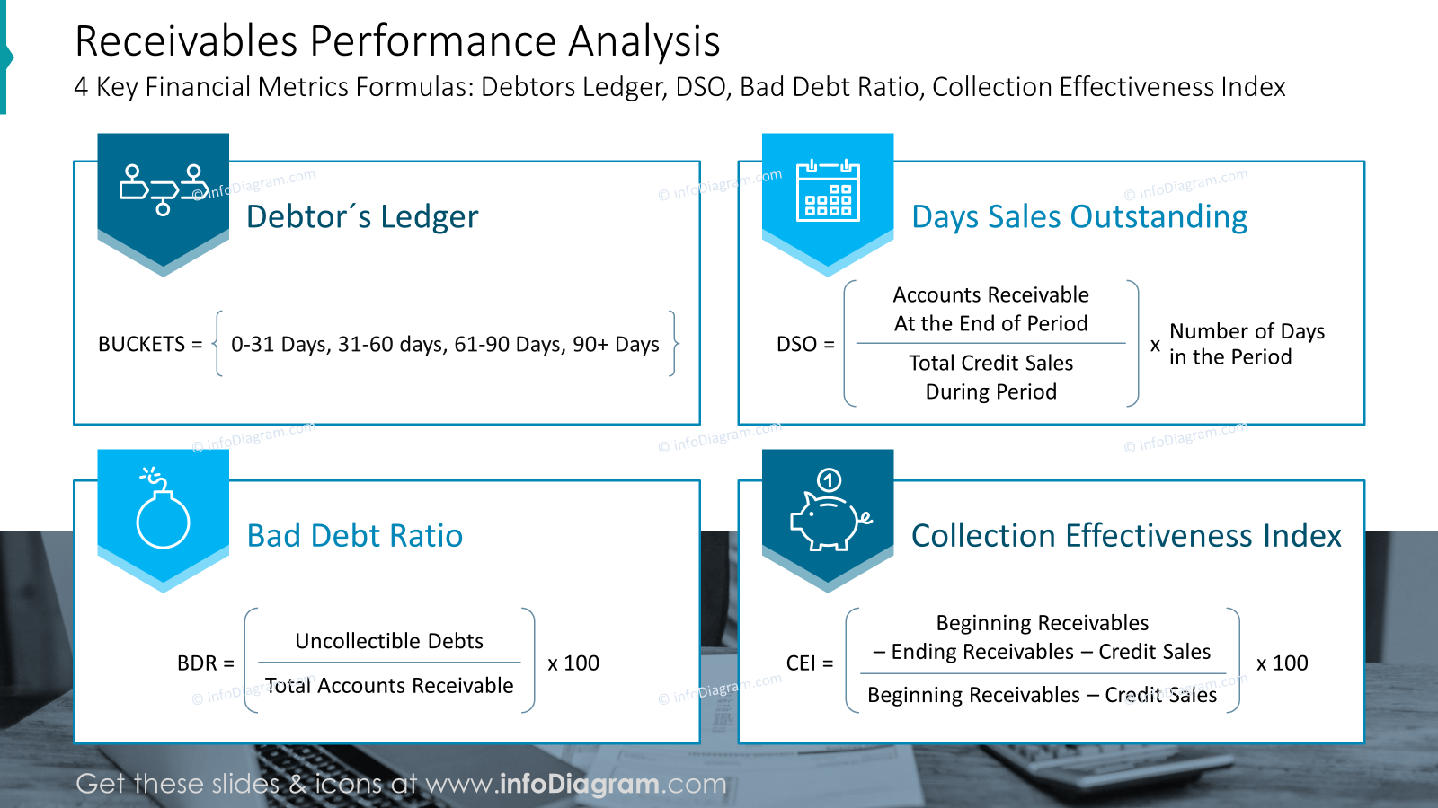
As there are four items to show, we used matrix structure to present content in the organized way. Each formula is inside a frame and visualized by an icon placed on a blue arrow. We used a full name of variables right inside a formula, for faster understanding without need to use additional legend.
Show Table of Top Customers evaluation
To present your top customers by overdue amount, you can use a PowerPoint enhanced table, instead of the default Excel table.
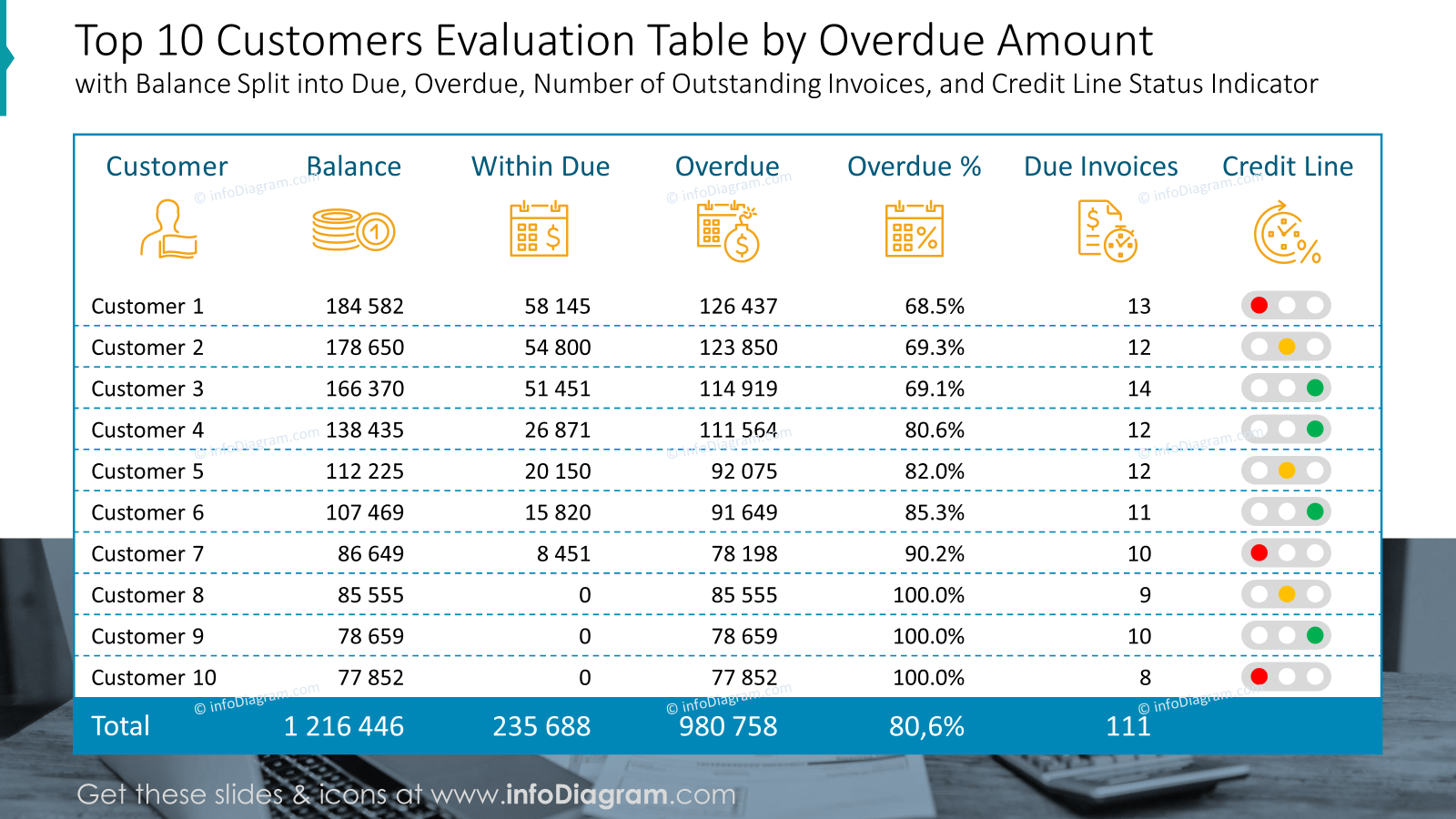
Adding icons to categories and stylizing the table gives a fresh touch to the financial table. Status icons in last column add a quick way for understanding of the customer credit line.
Presentation dashboard slide of AR overview
To present debtors Account Receivables overview, containing multiple data charts, use an organized way to create a slide.
Using a layout with a grid and consistent design style helps to make such dense slide readable.
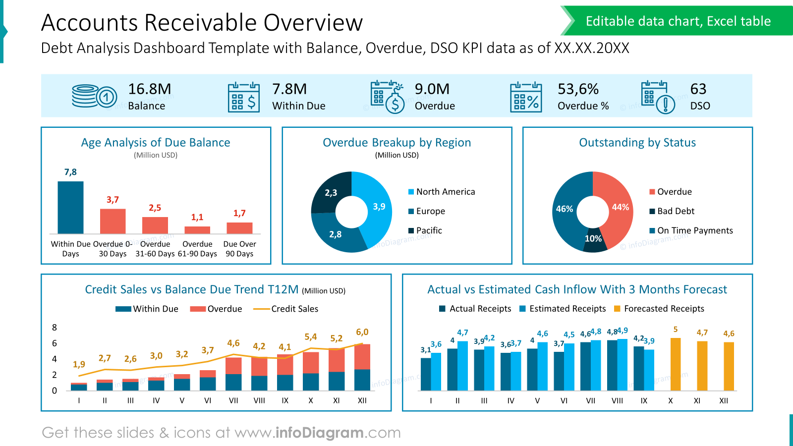
Good data visualization practise is to extract the most important data, not only show set of charts. For that, to highlight a key KPI data we used a contrast design rule. See how we extracted and visually underlined the top line with main numbers Balance, Overdue and DSO. Adding a subtle background can do a work.
Below there is a grid of frames with 5 charts inside:
- Age analysis off due balance
- Overdue breakup by region
- outstanding by status
- Credit sales vs balance due trend
- Actual vs estimated cash inflow with 3 months forecast
We removed all unnecessary information from charts to make them simple and easy to understand.
What to Remember about Visual Presenting Debtors AR report
If you want to present debtors AR report on the slide, remember a few simple rules:
- use a grid to show complex information on a slide like dense charts or tables.
- use a highlight color to emphasize key points and headlines,
- adjust and customize tables and data charts for clear structure and readability,
- keep the layout simple and clean,
- remember about white space,
- enrich your data with icons – properly chosen icons can nicely reflect the meaning of your content and can shorten time needed for understanding.
I’m sure that with these basic design rules, you can make a stunning Debtors AR report presentation and overall impression.
Resource: Debtors Analysis AR Financial Report Presentation PowerPoint Template
The slide examples above are from one of our financial PowerPoint templates. The full presentation is available in the infoDiagram collection of PPT graphics:
If you are in financial reporting, you can extend your data presentation with other topics.
See discounted bundles here
or try a free sample of financial charts