Design Tips to Present Business Transformation Strategy Visually
Visual communication is key to impactful business transformation strategy presentations. By presenting it more visually, you can engage your audience and foster a deeper understanding of the changes you plan to implement.
Let’s review some examples of how graphical slides can clarify your business transformation concepts.
Planning Structure of the Presentation
One of the ways to structure a business transformation presentation is to organize it around three questions, inspired by the famous Simon Sinek Golden Circle. Let’s have a look at how we illustrated it on the slide below. Notice how each question is represented with an adequate icon:
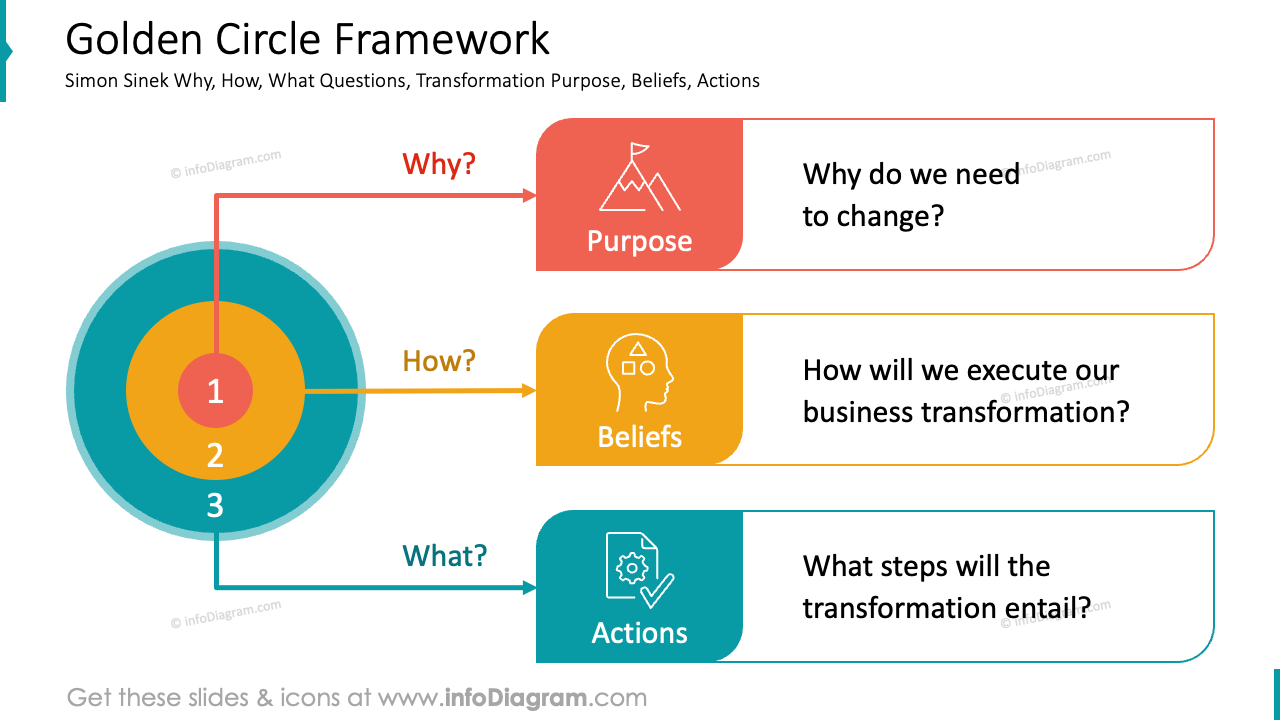
So the main transformation presentation sections would be:
- Purpose – Why do we need to change?
- Beliefs – How will we execute our business transformation?
- Actions – What steps will the transformation entail?
Here is an example of how we presented those points on an agenda slide. In addition to arranging the text clearly and legibly, we included a background image to enhance visual focus.
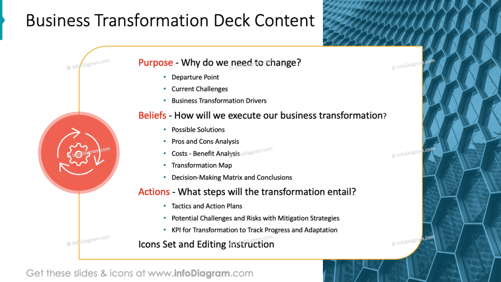
Get all the graphics presented here – click on the slide pictures to see and download the source illustration. Check the full set of Business Transformation Strategy Presentation PowerPoint Template.
Defining What is a Business Transformation
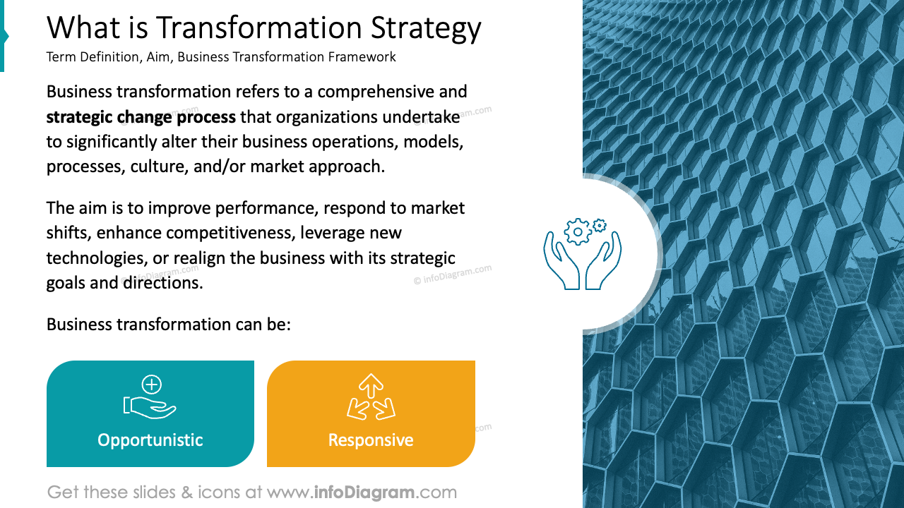
To provide a solid foundation for being understood by an audience of diverse backgrounds, we recommend defining the term business transformation. The easiest way is just to write a plain definition text:
Business transformation refers to an organization’s strategic, comprehensive process to fundamentally change its operations, structures, processes, or business models.
However, this can be presented more attractively than a plain text quote. You can illustrate it with some additional graphics, to make the term definition easier to read and understand. See on the slide below how we redesigned such a raw definition into a more graphical version.
Present Drivers of Business Transformation
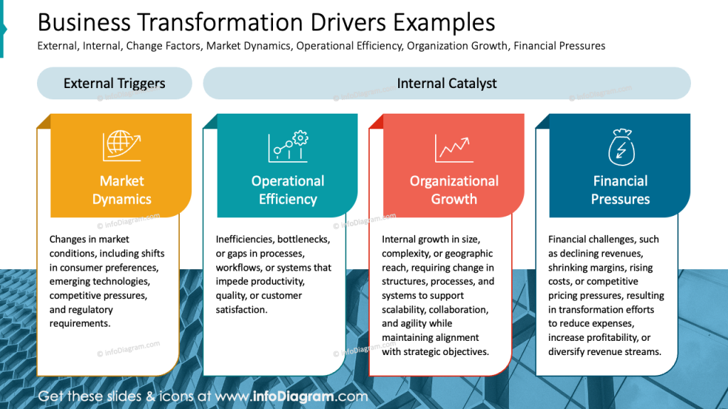
When you need to present examples of business transformation drivers on a single slide, instead of a plain text list, use column graphics to visually represent the content.
Such a layout provides more space for explaining each driver in detail and allows for easy comparison between different business transformation drivers.
Additionally, see how you can tag external and internal drivers above the particular column.
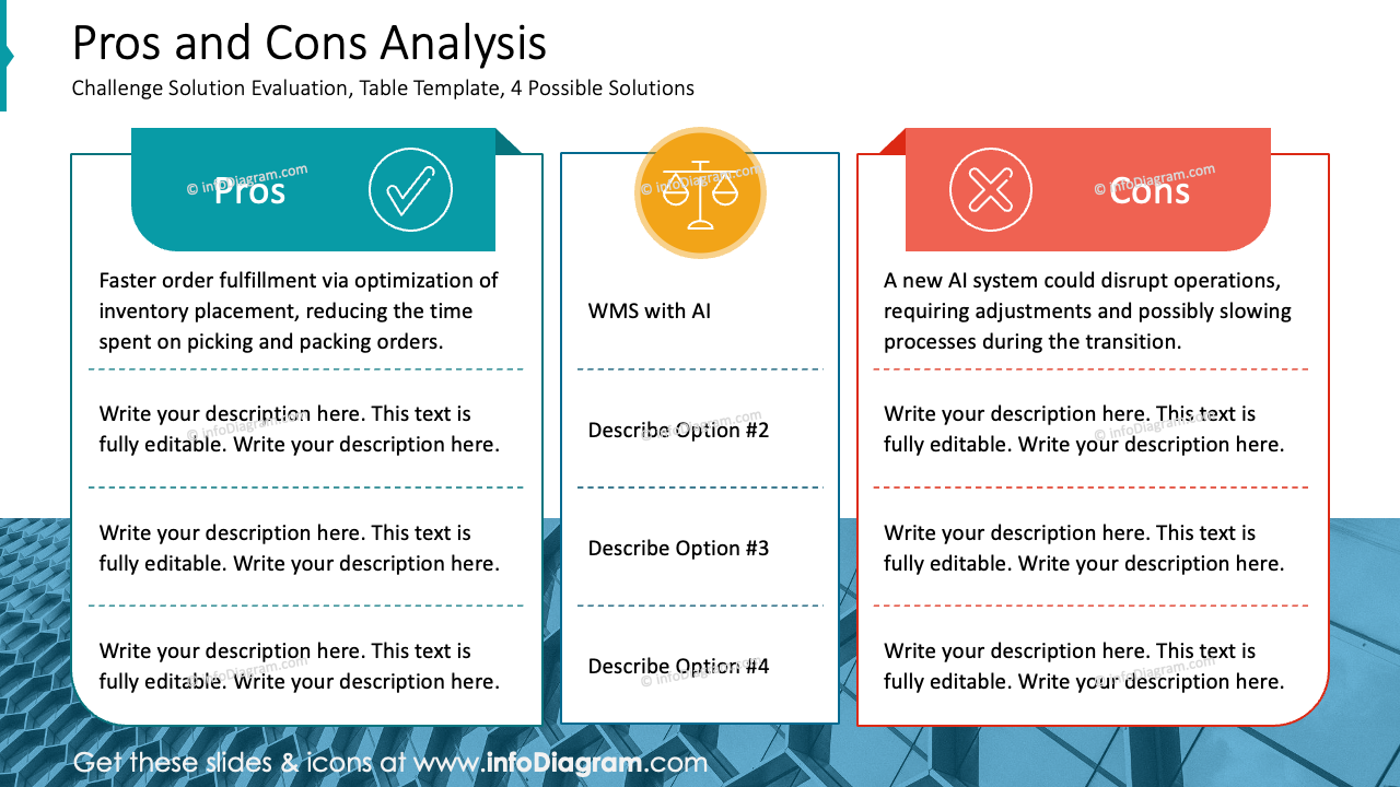
Comparing Pros and Cons of proposed transformation solution
To compare the advantages and disadvantages of a particular business transformation solution, you can list those pros and cons in several ways:
- The simplest way to present a list of items is in bullet points.
- For comparative content, consider using two columns side-by-side to highlight the differences.
- When comparing specific items row by row, a table structure can be particularly effective.
See below the example of such a comparison table after the graphical transformation, where we used various color coding for each column (turquoise for advantages and red for disadvantages).
Depending on how you want to present this comparison – by row or by column, you can apply simple animation to reveal content parts as you talk about them.
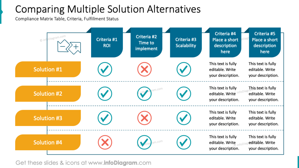
Show a Status Tracking of Business Transformation
When you present the fulfillment status of multiple transformation projects and their tasks, consider using a visual form of a matrix like a table with status icons.
Such a slide gives you a clear and concise overview of the current state of all your projects.
You can get inspired by our example, which we created using a table element and icons of checkmarks for completed tasks and a cross for unfinished ones. Thanks to using icons and not text symbols you can better control their look and also apply animation to those elements.
Also, consider this additional example of a comparison table that presents various solutions and how they meet specific evaluation criteria.
The inclusion of space for text allows for a more complete comparison, combining status and descriptions in one convenient table. We designed custom-shaped headers to give this table a creative look.
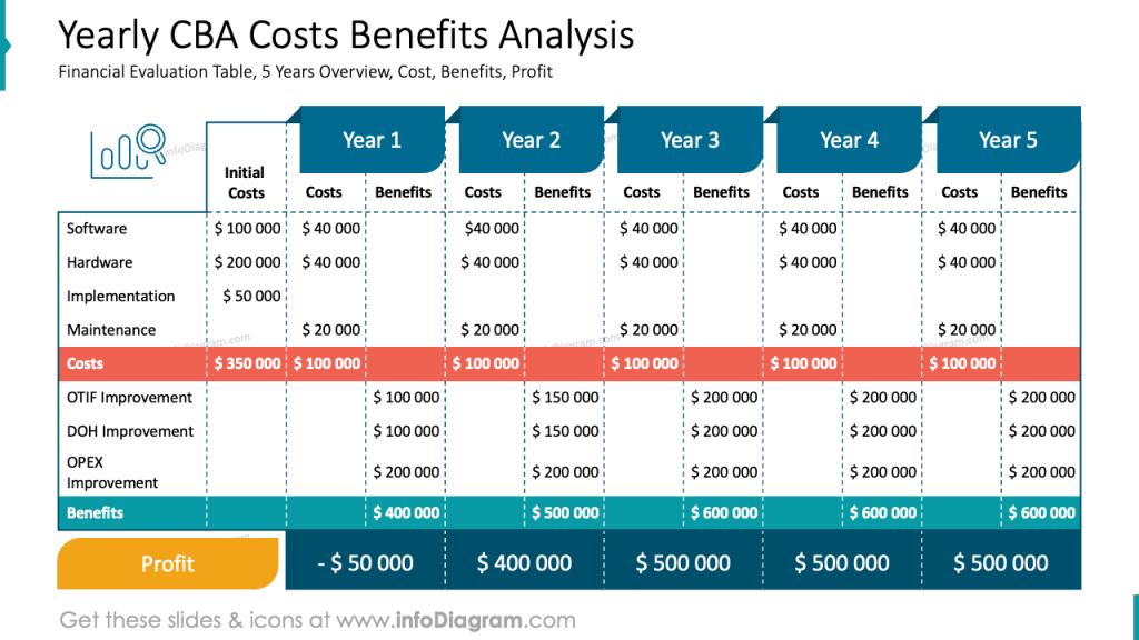
Presenting Cost Benefits Analysis Financial Data
Would you like to present your yearly CBA analysis? You can visualize it with enhanced table design in PowerPoint.
Start with an Excel table, and after copying it to a PowerPoint slide, customize the CBA table headers, adjust cell graphics, and highlight key metrics (in the example above it’s cost total, expected Benefits total, and final profit year by year) to create a visually appealing and informative presentation even when having a dense table to present.
Design Tips Summary to Present Business Transformation with impact
If you want to present the topic of business transformation in a clear and easy to understanding manner, remember a few simple design rules:
- support your presentation structure using a graphical way of showing main sections – using icons, colors, and visual agenda slide.
- avoid presenting the raw text definitions, illustrate it at least with a photo or diagram
- apply color coding for easier orientation on a slide or in the whole presentation
- adjust tables, and look for clear structure and readability. If you have a bit more time, add customized shapes to create a unique table design.
- illustrate your data with icons – properly chosen icons can nicely reflect the meaning of your content and can shorten the time needed for understanding.
I’m sure that with these basic design rules, you can make a stunning overall impression. tips, you can make a stunning presentation and overall impression.
Resources: Templates for presenting Business transformation deck
The slide examples above are from one of our financial PowerPoint templates. Full presentation is available in the infoDiagram collection of PPT graphics:
Check related articles with presentation examples:
- Secrets of Successful Business Planning – Slide Examples
- 10 Slide Examples of Presenting Go-to-Market Strategy
- Presenting Gap Analysis visually
- How to Present Change Management Models
- Presenting Business Growth Strategy with PowerPoint Diagrams
Watch the presentation video with slide design ideas:
Watch the guide with quick tips on how to transform an ordinary slide into a more attractive slide: