News: Extending blog: Design and PPTX hints
Looking at our previous posts, you could see we were not blogging too often. Once every 2-3 months. Our intention was mainly to share some specific diagram visualization examples. Now we are going to extend this focus – sharing some more general design and PPTX hints on using slides illustrations, giving hints on using PowerPoint or other presentation software. And showing you more about what we are cooking for you in our visuals kitchen.
However, the main focus will remain on visuals helping in communicating your message better. Why?
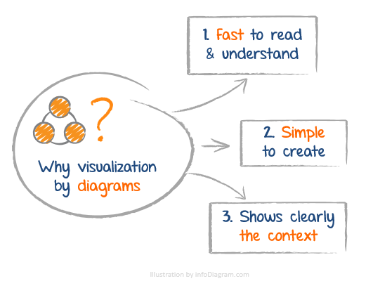
We pointed out three main reasons:

The reasons to use diagrams instead of plain text are very simple:
- they are fast to read and get the main ideas (easier for your listeners to understand what you are talking about)
- diagrams are easy to create (you need no special design skills)
- it is the fastest way to show the context clearly (with less text)
We mean especially diagram visuals, but sometimes add some more personal hand-drawn elements we love so much (hope you got our Valentines and Christmas icons).
Stay tuned for more posts.
Peter
PS. Some of our hints you could have found already on our LinkedIn, Twitter or Slideshare. You may check them for various shortcuts and design recommendations.
Further articles on presentation graphics
For more inspiration on using visuals in your presentations, or on how to implement graphics in an engaging way, check out these helpful articles:
- 3 diagram mistakes to avoid in slides design
- Why Diagrams Instead of Text Slides
- Presenting Timeline Using Infographics Diagrams
Want to be notified when we make an announcement? Never miss out on creative presentation graphics and stay informed about our latest updates and news. We’ll also send you a Creative slide design guide with FREE hand-drawn shapes for you to begin using right away!


