Last Updated on January 17, 2022 by Anastasia
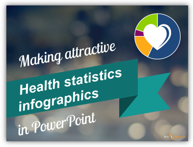
Working with data charts related to health or medicine? We’ve put together simple 4 step tutorial how you can make your medical data chart visually attractive. It’s a way to create quickly infographics presentation slide.
Actually, you can use these tricks for any kind of statistics visualization.
Continue reading 4 Steps to Make Attractive Medical Data Chart in PowerPoint