
When it comes to creating a chart in PowerPoint, knowing what to avoid is as important as knowing what to include. This short guide focuses on chart mistake examples in PowerPoint design and how to effectively address them.
Those data visualization tips are based on my experience as a slide designer with redesigning hundreds of slides presenting data in various forms. I believe noticing those common mistakes will help you create more professional presentations.
Chart Mistake 1: Redundant Information using PowerPoint or Excel Charts
A frequent issue with a chart in PowerPoint is the redundancy of data presentation.
This is a mistake that I see a lot around. It may be because people use default chart settings, and do not take the time to customize them.
As you can see in the picture below, the left chart contains information about data value – the CAPEX last year versus the budgeted value – in two places. In the horizontal axes and in the data label. It’s enough to keep only one of them for sake of data visualization clarity.
Simplifying the chart by choosing between data labels and axis labels can greatly enhance clarity, depending on what the audience needs to know.
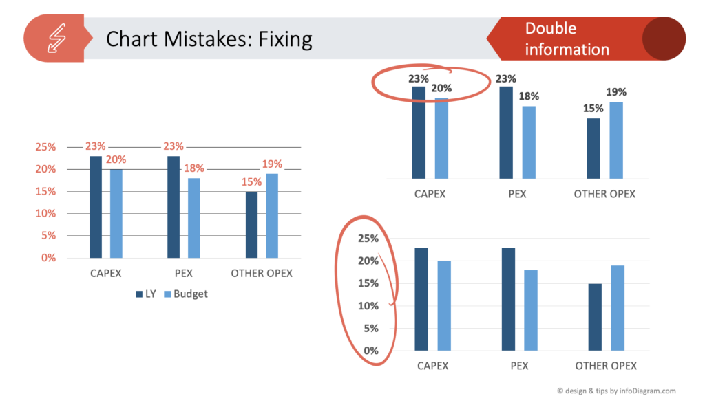
If your data presentation is too “wordy”, if it contains also lots of text information, also try to minimize the amount of text while keeping the main message. Check how in our other blog on simplifying complex presentation in three steps.
Chart Mistake 2: Missing Message in Your Data Slide
The next major mistake I observe a lot is the absence of a clear message in a PowerPoint chart leads to ineffective communication.
In the chart example I use here, you don’t see what’s the main meaning of this chart. Every chart has a message to tell. In our case it can be:
- Was last year’s expenses better or worse?
- What expenses were over the budget?
- Was the difference between budgeted and real expenses too big or OK?
It’s crucial to embed a key message or takeaway in every chart in PowerPoint to help viewers quickly grasp its purpose. You can put that message in the title – that’s what would usually a professional consultant would usually recommend. Personally, I prefer to do it in a more design way – pit the main data message in a chart summary call-out. You can create this call-out in some more outstanding design way, for example, put it inside a ribbon or at least a colored shape. This way it will be noticed on a slide.
Chart Mistake 3: Lack of Focus
Another mistake people tend to do is to present lots of information altogether without showing what’s more important and what’s less important.
Overloading a PowerPoint chart with multiple elements of equal visual importance can be overwhelming. The solution is to:
- Identify what data are crucial to show and what are only supportive
- Use design ways to show the visual hierarchy of those data. For example, using colors or working with whitespace on slides.
Focusing the viewer’s attention on one main point in the chart ensures a clearer and more effective presentation.
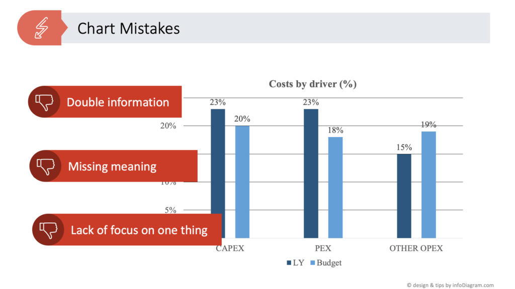
Chart Mistake 4: Over-Decorating Data Graphs
Related to the previous mistake is the over-decoration of data charts. It does not help to keep focus on important data. For example, using 3D styles and excessive embellishments in a chart in PowerPoint often detracts from its clarity.
I definitely recommend opting for more simple, flat designs and avoid gradient backgrounds or 3D bevel bar chart styles, as you can see bellow. This can make your PowerPoint charts more comprehensible and visually appealing.
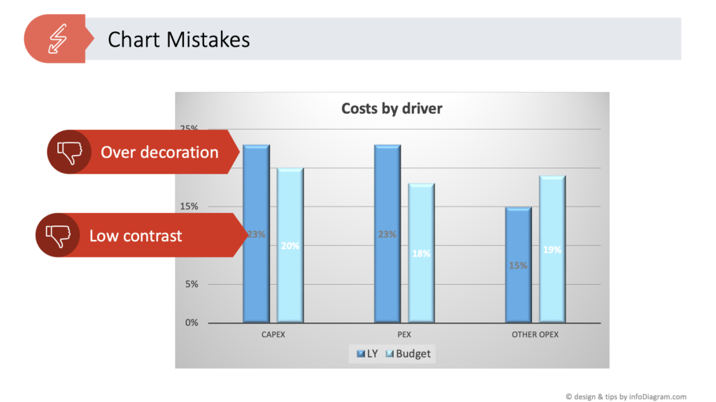
Chart Mistake 5: Poor Color Choices in PowerPoint Graphs
The next trap people fall into when presenting data is selecting low-contrast color schemes. It makes charts in PowerPoint difficult to read. High-contrast colors ensure that all elements of the chart are easily discernible, enhancing the overall readability.
I see that this color choice is often caused by a badly designed PPT palette. When you add a data chart in MS PowerPoint or MS Excel, it uses a color palette that you have predefined in your template. If those colors are too similar, your default data chart will look less readable. You can update chart colors manually, however, I recommend updating the whole color palette, if it’s possible for you. I can help with advice if needed (contact me via the infoDiagram contact page).
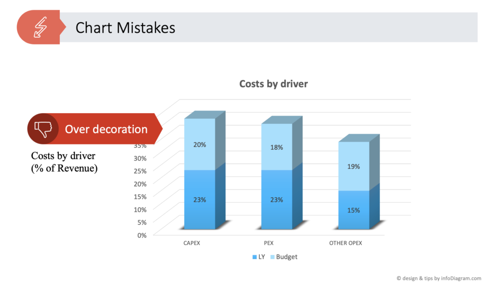
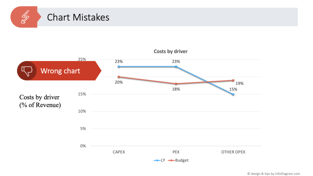
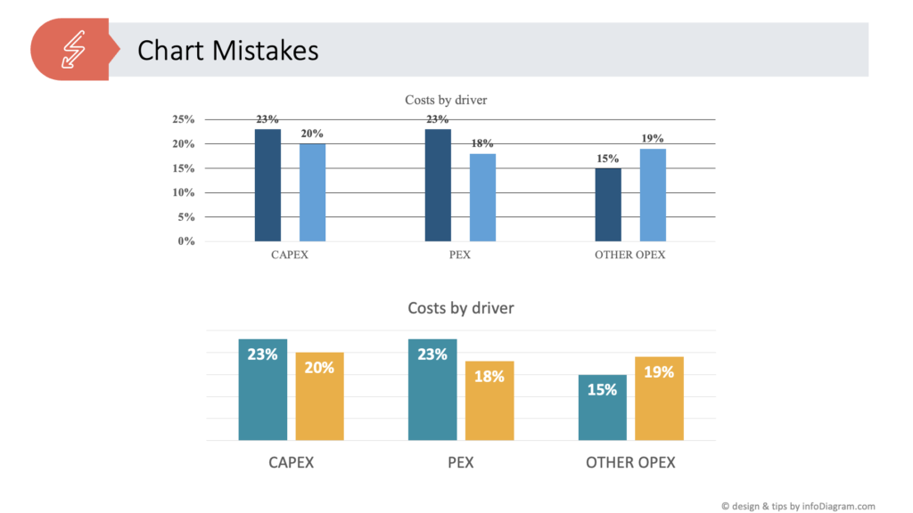
Chart Mistake 6: Choosing the Wrong Graph Type
Last but not least mistake in data visualization is using inappropriate chart type. For example, using line charts for data that are not linearly dependent. Line charts are to be used for data where the X-axis is of ordered data type, typically a time variable such as months, years, or seconds. You should not use line charts for categorical variables e.g. comparing sales over various product categories. The line in the line chart suggests there is a relation between different categories and that is usually not the case when you compare product categories.
Selecting an inappropriate chart type in PowerPoint can lead to misinterpretation. It’s essential to choose the right type of chart based on the nature of the data, ensuring accurate and effective communication.
See how to make sure you’ve chosen the most suitable chart depending on your content type.
Final Thoughts on Proper Data Charts Presentation
Perfecting a chart in PowerPoint involves more than just adding data to a template. It requires careful consideration of design elements, message clarity, and audience needs. By avoiding these common mistakes, you can create PowerPoint charts that are not only visually appealing but also convey your message effectively and efficiently.
Watch the full movie here:
Follow our YouTube channel if you want to see more of such guides, and subscribe to the newsletter to get more design tips and slide inspiration.
Author: Peter Zvirinsky, slide design trainer and the founder of infoDiagram
Reach out to Peter on LinkedIn or via his slide design & training website.