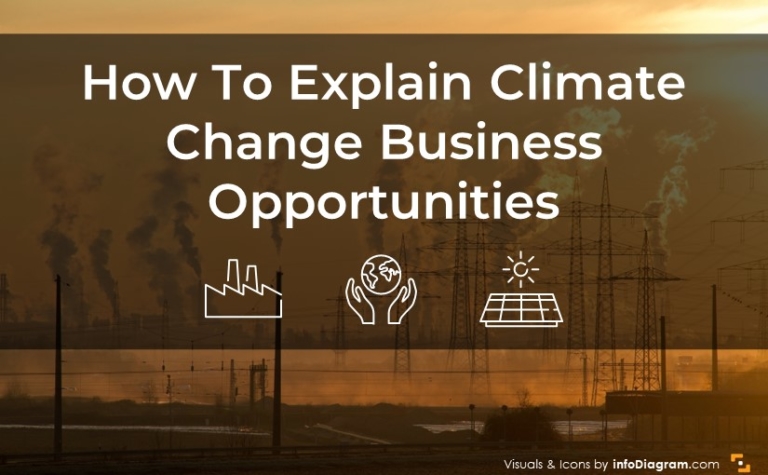
Explaining Climate Change Business Opportunities with PPT Infographics
Is it important to you to spread knowledge about climate change and some…
Graphical resources for any presentation and inspirational ideas on transforming the default slides into effective infographics. Read on to learn how you can make clear compelling presentations, and explain your ideas and concepts in an easy-to-grasp visual way.
Is it important to you to spread knowledge about climate change and some…

Are you presenting HR topics or talent management within your organization? Is developing…

Tables can help you present your information or data effectively. If you want…

If you are looking to present topics related to creativity, the human mind,…

Are you about to present a sales business case study to a potential…

For a company looking to sell a food or nutrition product, what you…

Are you looking for ways to present change management topics appealingly and engagingly?…

Preparing a webinar on slides for online presentation can be quite challenging. Presenting…
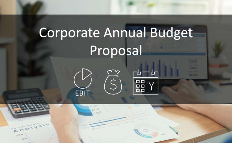
Working on your annual budget proposal? Financial presentations and documents can be difficult…

Do you need to present your business key information in a short overview? A…