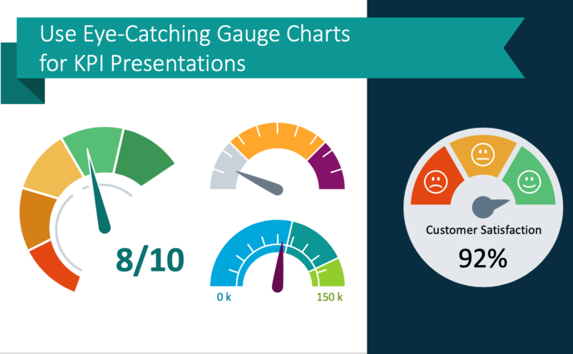
Has your company or team achieved a goal or reached a key progress indicator? How might you present such an abstract concept? Speedometer gauge charts make a perfect visual aid.
Continue reading Use Eye-Catching Gauge Charts for KPI Presentations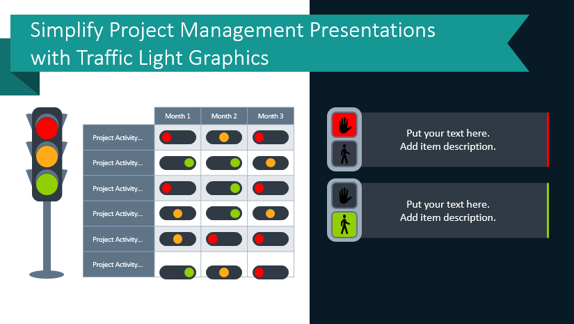
Simplify Project Management Presentations with Traffic Light Graphics
Visual metaphors are powerful. If you saw a traffic light with a red indicator, what would you think to do? Stop. A green light on a traffic light similarly would mean to “go” or “proceed”. The association of go and stop with the different color indicators on the traffic light creates a strong visual metaphor. You can harness that power for your next project planning and management presentations.
Continue reading Simplify Project Management Presentations with Traffic Light Graphics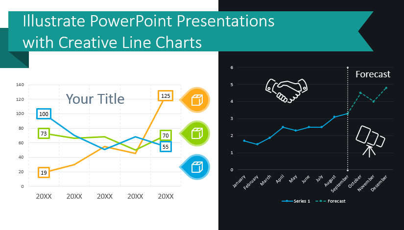
Illustrate Data-Heavy PPT Presentations with Creative Line Charts
Are you presenting a data-heavy topic? If you are presenting sales trends or product demand forecasts or manufacturing performance, you can give more impactful presentations with cohesive, creative graphs. You can avoid falling into the same old pattern of repetitiveness by using sharp, modern graphics. Elegant line charts can elevate your presentations and help your audience follow complicated presentations on difficult topics.
Continue reading Illustrate Data-Heavy PPT Presentations with Creative Line Charts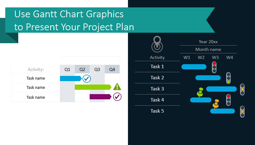
Use Gantt Chart Graphics to Present Your Project Plan
You want to present your project plan because it makes it easier to explain the overall schedule. You know it is important to demonstrate the timing of critical steps and how they depend on other tasks. You’ve learned that Gantt Chart tables are a visually striking, easy to follow way to present your project plans and they will help you set accurate estimates and manage your resources wisely.
Continue reading Use Gantt Chart Graphics to Present Your Project Plan
3 Design Tips for making Calendar Table Graphics attractive in PowerPoint
It’s this time of the year… Time to make plans! If you’re about to develop a strategy, timeline, or a step-by-step plan for the new year, calendars are what you may need. Creating your own calendar table in PowerPoint can be a time-consuming task.
Continue reading 3 Design Tips for making Calendar Table Graphics attractive in PowerPoint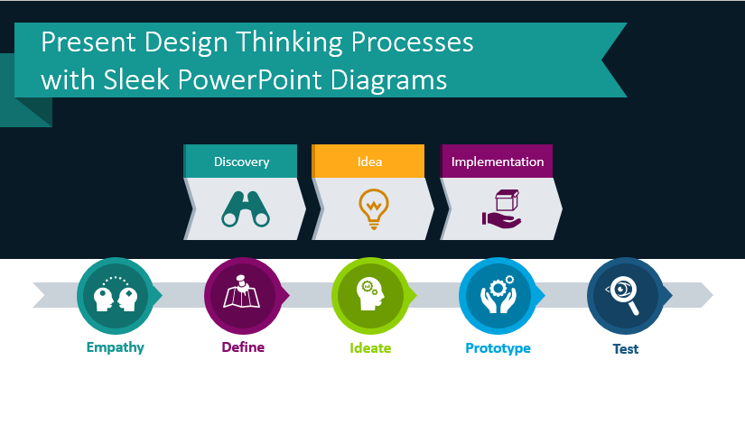
Present Design Thinking Process with Sleek PowerPoint Diagrams
Do you use the design thinking process in or on behalf of your business? Whether you’re literally developing design concepts with a team or are innovating your offerings with this approach, using impactful visuals will help you make your points.
Continue reading Present Design Thinking Process with Sleek PowerPoint Diagrams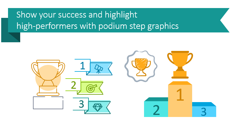
Show Your Success and Highlight High-Performers With Podium Step Graphics
Want to present your top performers or share which products sold the best in the last quarter? Reward high achievers. Let your team know they are doing well with podium graphics – a powerful visual metaphor.
Continue reading Show Your Success and Highlight High-Performers With Podium Step GraphicsPresenting Process Flow Clearly with Strong Block Arrow Diagram Graphics
Are you presenting a process that splits into 2 or more elements? Don’t waste time building graphics from standard arrow diagram shapes – they look rough, too much like the default and often don’t show the flow nicely. We know creating a fitting and eye-catching flowchart graphics can be time-consuming. Get inspired by modern, user-friendly flowchart graphics that our team created. Using such visuals will accentuate your message rather than stealing the spotlight.
Continue reading Presenting Process Flow Clearly with Strong Block Arrow Diagram Graphics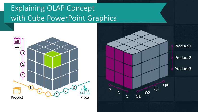
Explaining OLAP Data Cube Concept with PowerPoint Graphics
Presenting how complex data analytics operation works is hard. While explaining the OLAP data cube concept, you need to express several abstract terms at once. However, you also need to maintain your audience’s attention. They can’t learn what you need them to if they lose track and fall asleep!
Continue reading Explaining OLAP Data Cube Concept with PowerPoint Graphics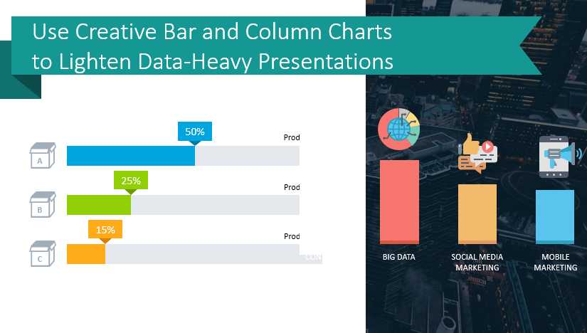
Use Creative Bar and Column Chart Templates to Lighten Data-Heavy Presentations
Is your next presentation containing a bunch of small graphs, default column chart diagrams and tables? All stuck together on one slide? Then you’re suffering a data-heavy slide symptom.
Continue reading Use Creative Bar and Column Chart Templates to Lighten Data-Heavy Presentations