
Defining concepts like distributed ledger, block structure, benefits and the applications of blockchain technology in various industries are often necessary for presentations. How do you make the descriptions and definitions come alive?
Continue reading Explain Blockchain Technology Effectively with Modern Graphics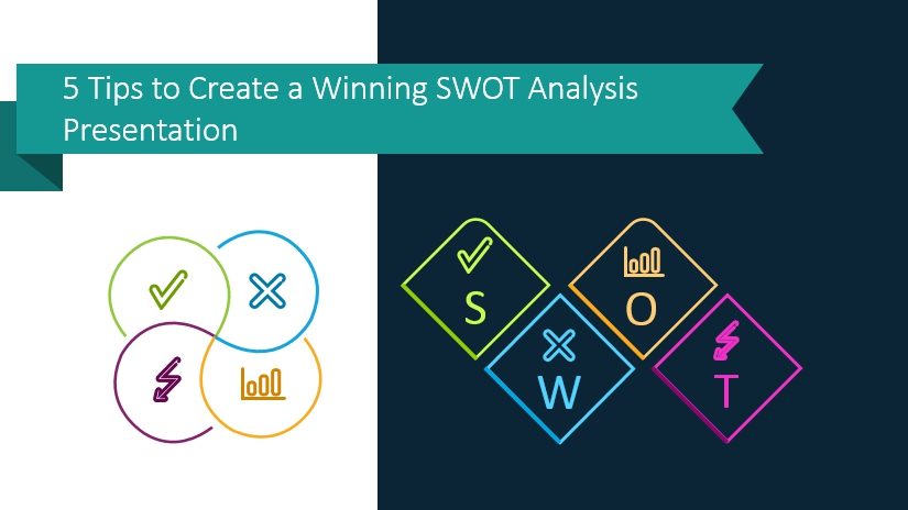
5 Tips to Create a Winning SWOT Analysis Presentation in PowerPoint
SWOT analysis presentation is an effective instrument, which you can use to influence stakeholder’s decisions. For this reason, it’s important to learn how to identify strengths, weaknesses, opportunities, and threats and how to illustrate them effectively so the audience will get your message.
Continue reading 5 Tips to Create a Winning SWOT Analysis Presentation in PowerPoint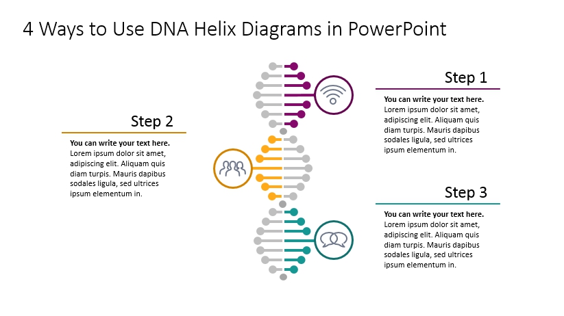
4 Ways to Use DNA Helix Diagram in PowerPoint
Have a presentation about organizational culture or values? Or looking for a way to show a yearly or a monthly timeline creatively? Consider using a DNA helix diagram.
Continue reading 4 Ways to Use DNA Helix Diagram in PowerPoint
How to Show Comparison with Pros and Cons PowerPoint Diagrams
Do you need to add a slide with advantages and disadvantages in comparison to your presentation? In this blog, we offer visual examples of how to illustrate the pros and cons of a business process, product, strategy, or decision using visual aids.
Continue reading How to Show Comparison with Pros and Cons PowerPoint Diagrams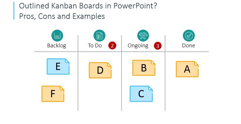
Outlined Kanban Boards in PowerPoint? Pros, Cons and Examples
The essence of the Kanban approach to agile project management lies in using visuals. The best form of using a real physical whiteboard and presenting it face to face. However, this is not always possible, especially if working with remote teams.
Continue reading Outlined Kanban Boards in PowerPoint? Pros, Cons and Examples
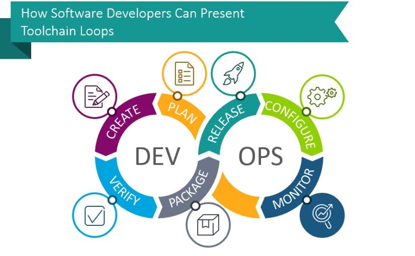
Creative Inspirations for Presenting DevOps Toolchain Loop
When working in software development management, you may need to present the frameworks you use in a clear and engaging way. The best way is to show it all visually, such as a toolchain loop.
For example, when talking about Development Operations toolchain sequence, use a simple loop diagram. By using different styles and colors you can highlight and explain different stages and elements of the DevOps toolchain.
Continue reading Creative Inspirations for Presenting DevOps Toolchain Loop
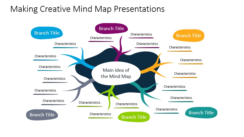
Making Creative Mind Map Presentations
Developing and sharing ideas, complex ones can be difficult. When presenting it to other people you should take care that the idea will be understood clearly, as well to ensure it will be engaging. Using the mind map method helps to solve both of those issues.
Continue reading Making Creative Mind Map Presentations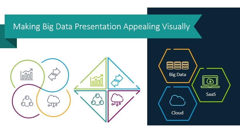
Making Big Data Presentation Appealing Visually
Are you about to present Big Data or other modern cloud-based IT technologies? You know your Big Data presentation will probably contain various abstract and complex topics that are not so easy to explain using only a verbal form.
Continue reading Making Big Data Presentation Appealing Visually
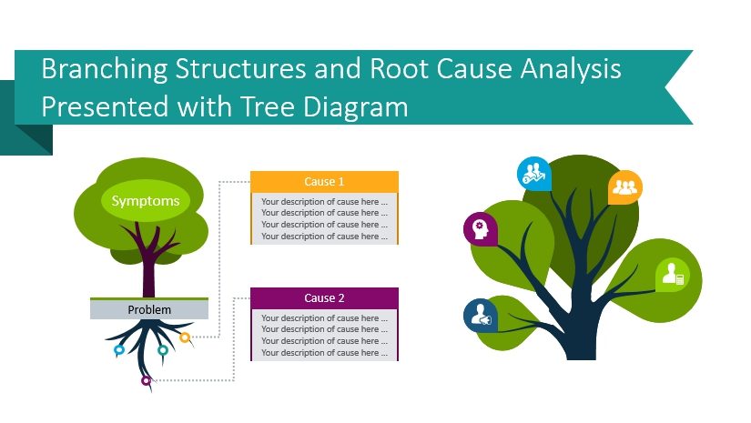
How to Illustrate Branching Structures and Root Cause Analysis with Tree Diagram
Trying to find a way to present a problem-cause relation creatively? A visual tree diagram is a suitable illustration for showing a problem root cause analysis, as well as various branching charts and hierarchies.
Continue reading How to Illustrate Branching Structures and Root Cause Analysis with Tree Diagram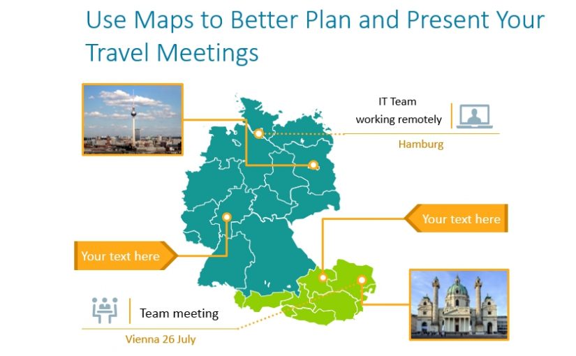
Use PowerPoint Maps to Better Plan and Present Your Travel Meetings
International travel can easily be illustrated with PowerPoint maps and other graphics. You can highlight relevant areas on the map and specific aspects of maps that can help make your points.
Continue reading Use PowerPoint Maps to Better Plan and Present Your Travel Meetings