Free Webinars on Improving PowerPoint Presentations. Announcement for August 29th!
Want to learn tricks for designing stunning clear presentations? We are launching a free webinar series – design sessions with our lead designers. They will be sharing advice and tips on how to transform ordinary busy slides into professional presentations.
Recently we hosted webinars where Peter, our co-founder and chief designer, was sharing secrets about transforming PowerPoint tables and improving the look of bar charts. In case you missed it, let’s dive into the key takeaways. Also, we’re happy to share that the new webinar is coming soon!
If you missed it, you can still join the upcoming webinar, or learn more about tables and data visualization in our PowerPoint slide design workshop we organize.
Insights from PowerPoint Tables Tricks Webinar
During the webinar, Peter, a data visualization expert and presentation consultant (you can follow his posts on LinkedIn), shared a bunch of table formatting techniques. With those, you can turn default tables into eye-catching graphics.
We first discussed common table design mistakes and how to avoid them. For example, problems with a lack of focus and wrong design contrast. Then Peter presented ways to convey information with less text and about fixing the readability of tables with some less-known PowerPoint features.
During this live session, Peter showcased how several simple yet powerful tweaks will make your table more accessible and captivating for your audience.
Takeaways from the Webinar on Creating Smart PowerPoint Bar Charts
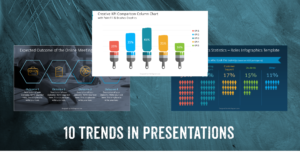
This time, our chief designer was discussing practical techniques for improving the look of bar charts. Bar charts are widely used in presentations, they help turn boring data into visual stories that everyone can follow.
During the webinar, we discussed how to quickly spot and fix frequent data visualization mistakes, use PowerPoint features for a professional data chart look and enhance bar charts’ readability and clarity with graphics.
Peter also showcased how several simple design tricks will make your bar chart easy to follow and understandable for your audience.
Drumroll, please! Save the date for the next free webinar “Make Dense PowerPoint Presentations Pop with Icons” – Aug 29th
Our next webinar will be all about improving dense presentations and practical solutions to avoid overcrowded slides. Whether you feel like your presentations could use a creative boost, or you’re tired of those same old slide layouts which are full of text, this webinar can be for you.
Join us on August 29th, book 30 minutes that suit you, and learn how to make your presentations stand out.
Trust us, this can be a game-changer. Tricks Peter will share will save you several hours of PowerPoint work every time.
During the webinar, our expert speakers will cover the following topics:
- solutions to avoid overcrowded slides
- power of icons – using graphic symbols effectively
- 3 quick ways to incorporate an icon into your slide design
Book your place to learn how to harness the power of symbols to simplify complex ideas, enhance storytelling, and make your messages more memorable.
🎁 We’ve also prepared bonus perks for webinar attendees:
- exclusive 60% off from our new icon PPT mega bundle with 1000+ symbols
- live Q&A, where you can ask any design-related question
- free download of presentation file with graphics to use
Stay tuned, more to come!
Mark your calendars for August 29th and reserve your spot in our next free webinar.
Join our mailing list to stay tuned in for more updates and valuable resources as we continue our journey to help you become a presentation superstar. We’ll see you at the next webinar, ready to unlock the true potential of PowerPoint together!
Further inspiration
Looking for more inspiration? Check the following articles:
- Matching a data chart to the content type
- How to Find the Right Icon and Use It
- Five Creative Ways to Embed an Icon in Your Slide Design
- Use creative bar and column chart templates to lighten data-heavy presentations