How to present Business Growth Strategy Plan with PowerPoint Diagrams
If you aim to influence your audience with the business growth strategy, imagine…
If you aim to influence your audience with the business growth strategy, imagine…
If you’re working in the IT, data science, or data analytics field or…
Are you already planning the new year? If you are working on building…
If you’re planning to talk about ecology, circular economy, sustainability, or any climate…
Are you preparing slides about market segmentation? Or you’re working on a presentation…

Do you have learning and education presentations coming soon? Presenting new information to…

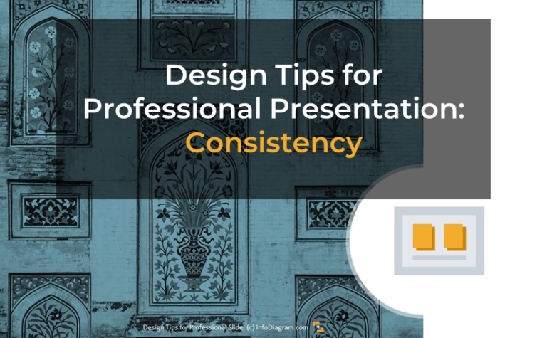
Looking for ways to make your PowerPoint look more professional? Check out six…
Operational marketing incorporates various processes and topics you may need to coordinate and…
Managing supply chain operations, trying to choose the right supplier, or having to…

Are you working in sales as a manager who needs to define buyer…

Are you looking for ways to facelift your presentation and make a professional…

Managing a project, need to keep track of your team’s progress, or explain…

Are you about to present a company’s compensation and benefits scheme in your…

Want to take your presentation skills up a notch? We’ve pulled together some…

Want to make your slides look clean and more appealing? You’ll be surprised…

If you are presenting medical topics, using graphics can help you present more…

Presenting your message clearly is crucial to be understood. We’ve got the secrets…
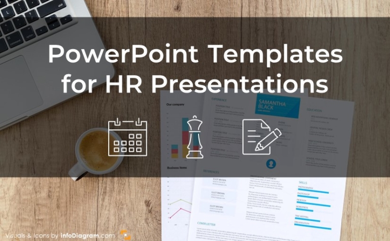
Working in the human resources department of middle or bigger companies involves effectively…