![New way of getting single slide – Subscription Plans [news]](https://blog.infodiagram.com/wp-content/uploads/2015/08/subscriptoion_table_thumb1-2.png)
Today we are happy to have the first subscribers using the system. Here we present what it is about, how it works.
Continue reading New way of getting single slide – Subscription Plans [news]
infoDiagram visual slide examples, PowerPoint diagrams & icons , PPT tricks & guides
Today we are happy to have the first subscribers using the system. Here we present what it is about, how it works.
Continue reading New way of getting single slide – Subscription Plans [news]
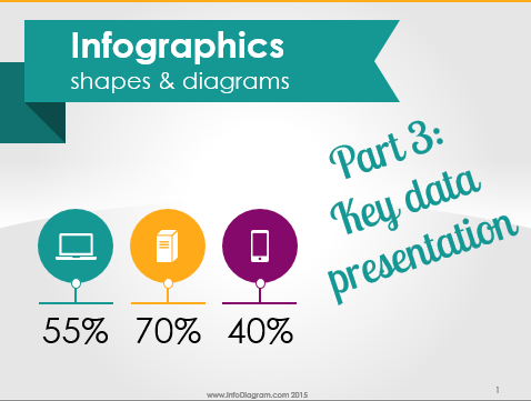
Are you presenting some important data values on a slide? KPI numbers, company fact sheet, or sales campaign numbers?
Learn how to present numbers in a creative, strongly visual way, that will make your presentation outstanding.
We put together a bunch of slide designs for situations when you need to show a few critical values that should attract all eyes in the room :).
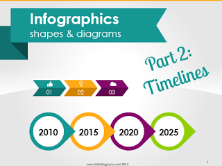
Are you presenting timeline or time sequence information? It can be a process description, a company history, or a procedure explanation.
Here are some examples of how you can change this text information in a visually attractive way.
Continue reading Presenting Timeline Using Infographics Diagrams
Do you have a classical bullet point text slide with a list of items while making your presentation? You can easily change it to simple infographics slides and make your presentation more understandable and attractive to customers. Continue reading Making infographics slides from text lists [Slideshare]
This is a continuation of part I. In the previous post I have described how to find data and prepare slide format. Also how to setup background for your infographics.
Continue reading How to create infographics in PowerPoint – part II
Surely you have seen many great infographics. Want to create your own? Never did it before?
Continue reading How to create infographics in PowerPoint – part I
Here’s an example of how our icons were applied for a presentation made in Apple Keynote.
The presentation gives simple hints on how to plan six months ahead of your business.
Continue reading Using icons for illustrating Keynote presentation on business planning [Slideshare]
Chances are you have used some diagrams or workflow schema in your presentation, right? If you do, respect :). Diagrams are indeed an excellent way to visualize your message. Here are three design hints to make sure your diagrams are professional looking and remain readable. Three ideas on how to avoid the most common diagram mistakes.
Continue reading 3 Diagram Mistakes to Avoid in Presentation Slides DesignLast month infoDiagram turned three years old since our full service. And it’s been amazing years so far.
If you wonder who’s behind infoDiagram, how it all started, this is a good occasion to learn more about our roots.
Continue reading Story how we started with infoDiagram
We have been putting together visual slides for our colleague Marcin, some time ago.
Marcin was impressed by the book he was reading and wanted to note down the main ideas for himself and share them with others.
Continue reading Designing doodle presentation on time management [Slideshare]
![Making infographics slides from text lists [Slideshare]](https://blog.infodiagram.com/wp-content/uploads/2016/02/infographics_list_slide_1.png)


![Designing doodle presentation on time management [Slideshare]](https://blog.infodiagram.com/wp-content/uploads/2016/02/doodle_time_mng_hints_slide_ppt1.png)