How to Visually Present CapEx Report Using PowerPoint
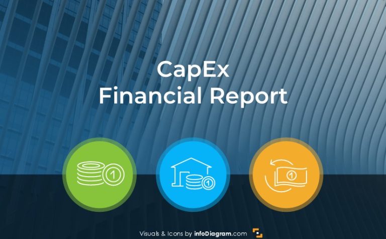
Need to present insights of your CapEx performance, or evaluate capital expenditures? Get…
Need to present insights of your CapEx performance, or evaluate capital expenditures? Get…

Do you need to present the JTBD framework? Explain the Jobs to Be…

Visual communication is key to impactful business transformation strategy presentations. By presenting it…

Are you about to present the manufacturing KPI or performance of a plant…

Are you looking for ways to present Machine Learning Algorithms? Mathematical models used…

Are you looking for ways to pitch or explain an Artificial Intelligence technology…

Need to present the status of your inventory or your stock management performance…

Do you need to present your debtors accounts receivable status and analysis of…
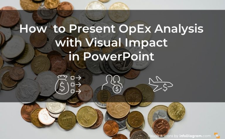
Need to present an operating expenses analysis outcomes? Check out our examples of…

Why a company with high sales and margins might still face turbulences? I’d…

Do you need to present a Balanced scorecard framework? How it works, and…
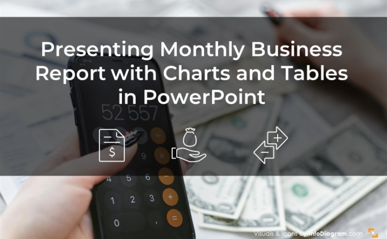
Are you doing regular business reviews? Whether it is monthly or quarterly reports,…

A professional presentation aims to deliver a clear message in every presentation slide. …
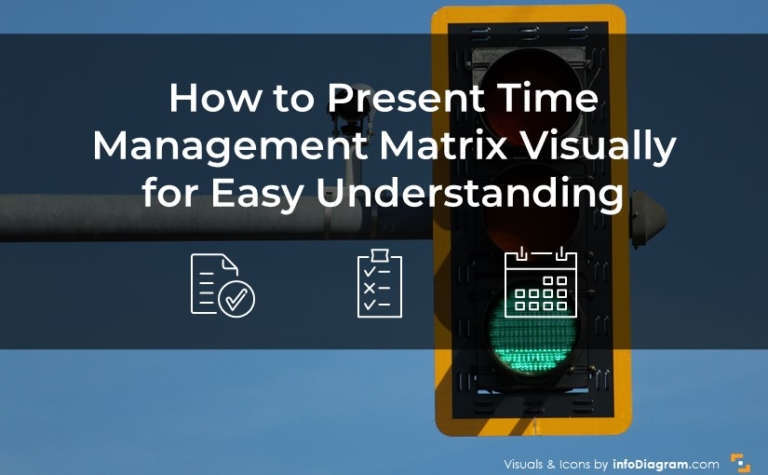
Do you want to present time management topics? Consider using a visual way…
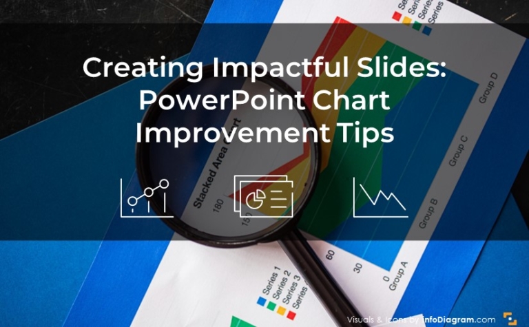
As a slide designer, I frequently work on enhancing charts to make them…
Creating compelling visual slides in PowerPoint is more than just an exercise in…
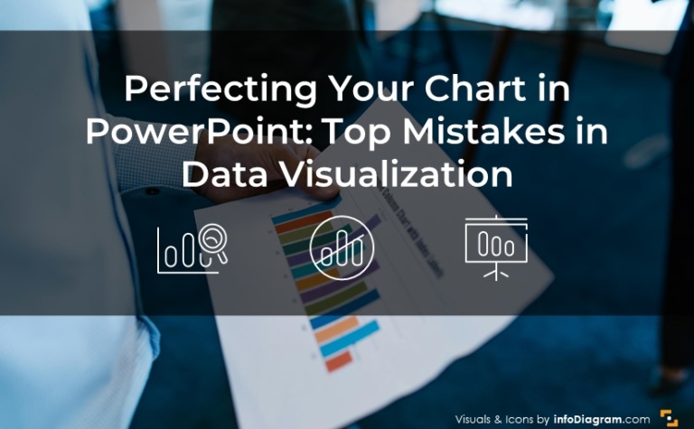
When it comes to creating a chart in PowerPoint, knowing what to avoid…

Do you want to showcase a B2B segmentation in a visually compelling way?…

Do you need to present real estate property in an impactful way, or…

Do you want to present a quoted company financial report in an eye-catching…